Overview
As a Product Designer at Nestlé Health Science, I worked alongside Product Managers to design a new cart and checkout experience to replace the existing checkout process. Due to time and resource constraints, I was limited in designing the experience, using existing Magento templates with minimal customization and leveraging industry best practices.
Software: Figma
Platform: Magento
Timeline: 4 weeks
Role: Product Designer
Credit: Nestlé Health Science
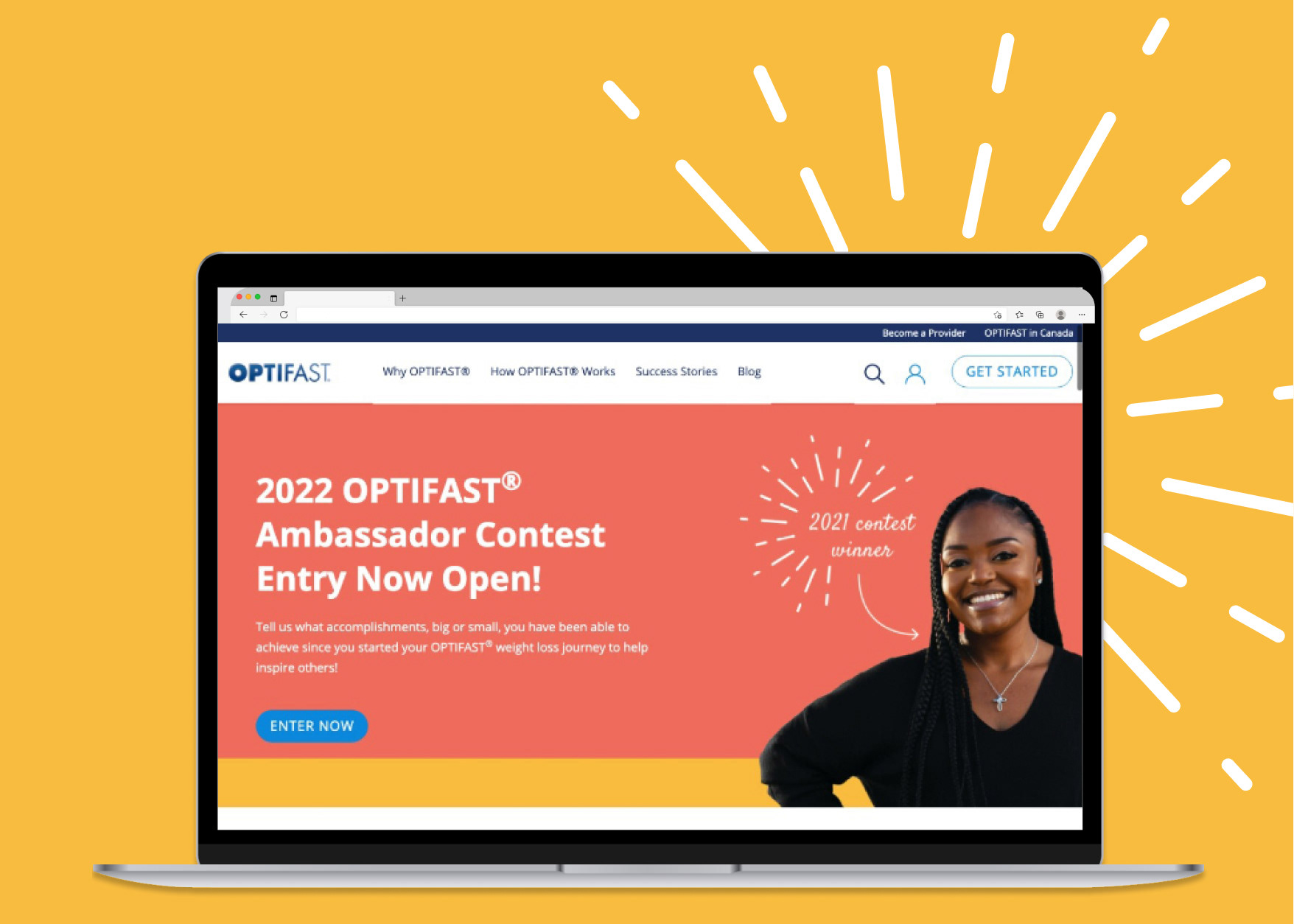
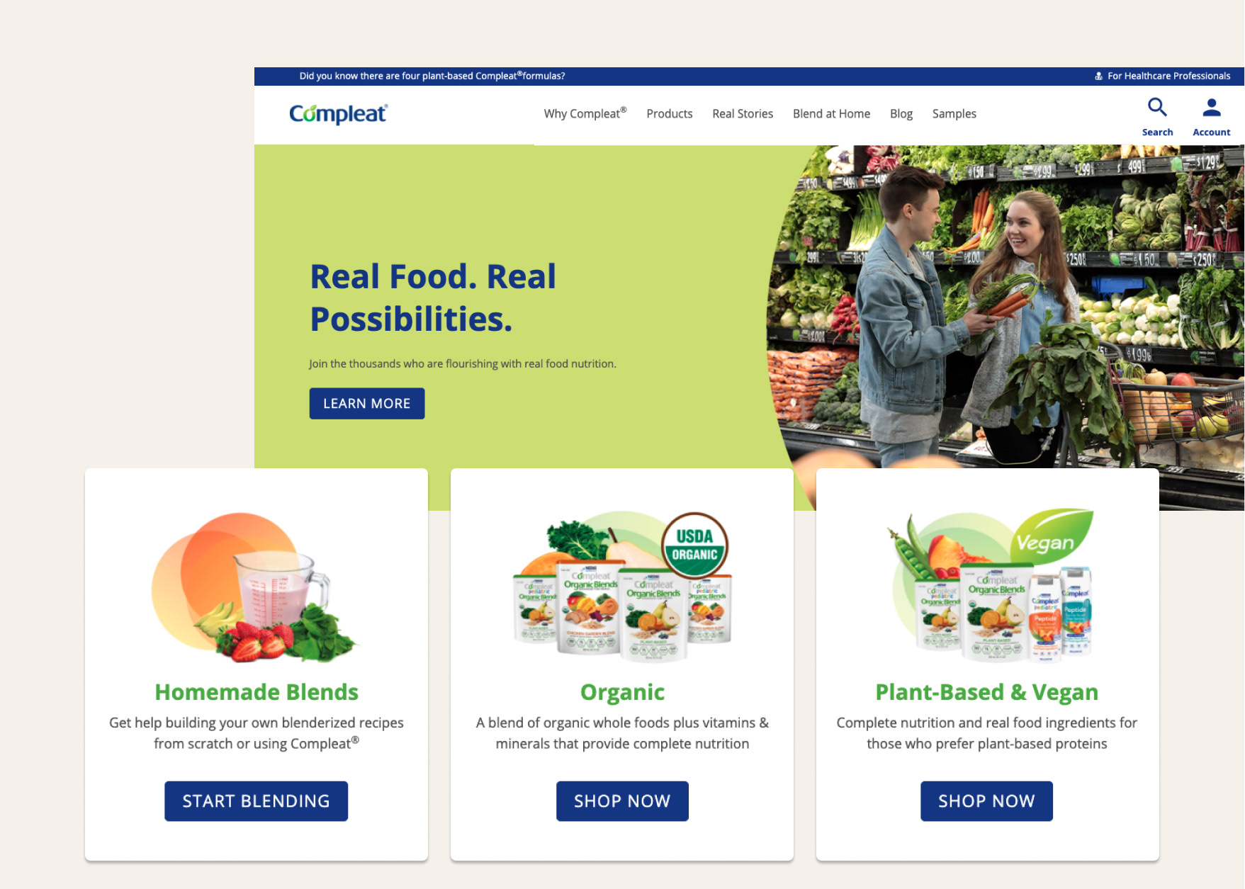
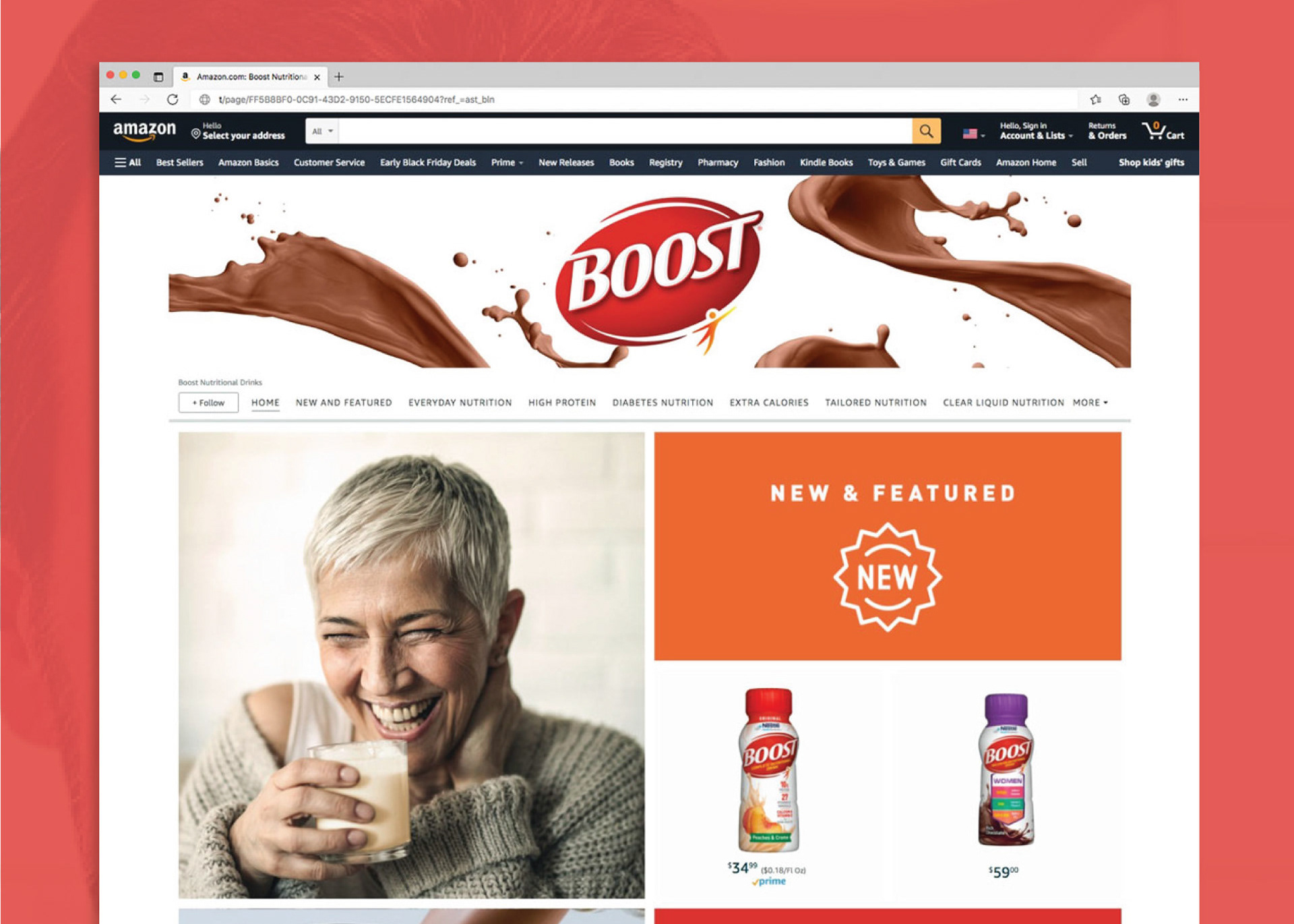
nestlehealthscience.com
The current cart and checkout:
✔️ The busiest screen is shown right from the start. There's no escaping the Summary view, which has to display all the information. But having it as the home of the process may overwhelm the user.
✔️ Required input fields lack a symbol or text to help users; users find out after pressing Next that the input field is required.
✔️ It's hard to tell where you are in the process, how you got there, and where the buttons will take you.
User needs to:
✔️ Buy something quickly
✔️ Add multiple shipping addresses
✔️ Be able to track an order easily
✔️ Pay with store credit
✔️ Reinforce the message that card payments are safe
✔️ Have the ability to save addresses
Process
Market research
To begin the project, I analyzed the current checkout experiences of leading brands such as Amazon, Target, and Walmart. My aim was to identify best practices and areas for improvement. I focused on the layout, design, and flow of the checkout process, as well as any features related to fraud protection and address verification.
I identified common elements and patterns that made for a great checkout experience through my comparison. These included a clear, concise overview of the order details, a progress tracker, dedicated sections for entering shipping and billing information, and a prominent call-to-action button. I used these findings to create a design incorporating these elements into the checkout experience. I also included credit card fraud protection and address verification systems.
To address the lack of credit card fraud protection and address verification, I added a pop-up window that prompts customers to confirm their shipping address and credit card information before finalizing their purchase. This pop-up window also asks customers to confirm that they are authorized to use the credit card, helping protect against fraud.
The new checkout experience is optimized for mobile-friendliness and for all elements of the checkout process on small screens.
Constraints
Since I was limited to using existing Magento templates, I had to adapt the designs created to fit within the existing framework. I used visual cues such as clear icons, colors, and text labels to guide customers through checkout.
Unfortunately, due to the limitations of the existing templates, I could not integrate third-party software or provide autocomplete for the forms. However, I designed the forms as user-friendly as possible, with clear labels and easy-to-understand instructions.
Outcome
The new cart and checkout experience provides Nestlé customers with a streamlined and secure shopping experience. Despite the limitations of the existing Magento templates, I was able to add several new features that aren't present in the previous checkout experience. By comparing checkouts from leading brands, I identified best practices and areas for improvement to incorporate into the new experience.