Bespoke is Anywhere Real Estate's design system, serving a 22-person UX organization across enterprise and consumer products. The hard part was never the components. It was about building the governance that keeps a system alive after launch, when pushback starts, and shortcuts get tempting. Over two years, I worked across all three phases of its lifecycle, and the part I am most confident about is the change process the team still uses.
The initial audit provided the incoming design lead with real usage data to build from, rather than a blank canvas. Ongoing maintenance and expansion grew the system across seven brands. The pattern migration brought reusable work back into the shared library. My contributions spanned component design, brand and icon design, color theming, documentation, and the organizational process that kept the system and the team aligned.
7 brands themed from one token architecture
22 designers working from a single source of truth
10 typefaces evaluated in the foundation phase
3 lifecycle phases owned, from founding audit to migration
22 designers working from a single source of truth
10 typefaces evaluated in the foundation phase
3 lifecycle phases owned, from founding audit to migration
My contribution
Product designer II
Visual designer
Documentation
Change management
The team
1x lead designer
1x product designer
1x accessibility designer
3x front-end engineers
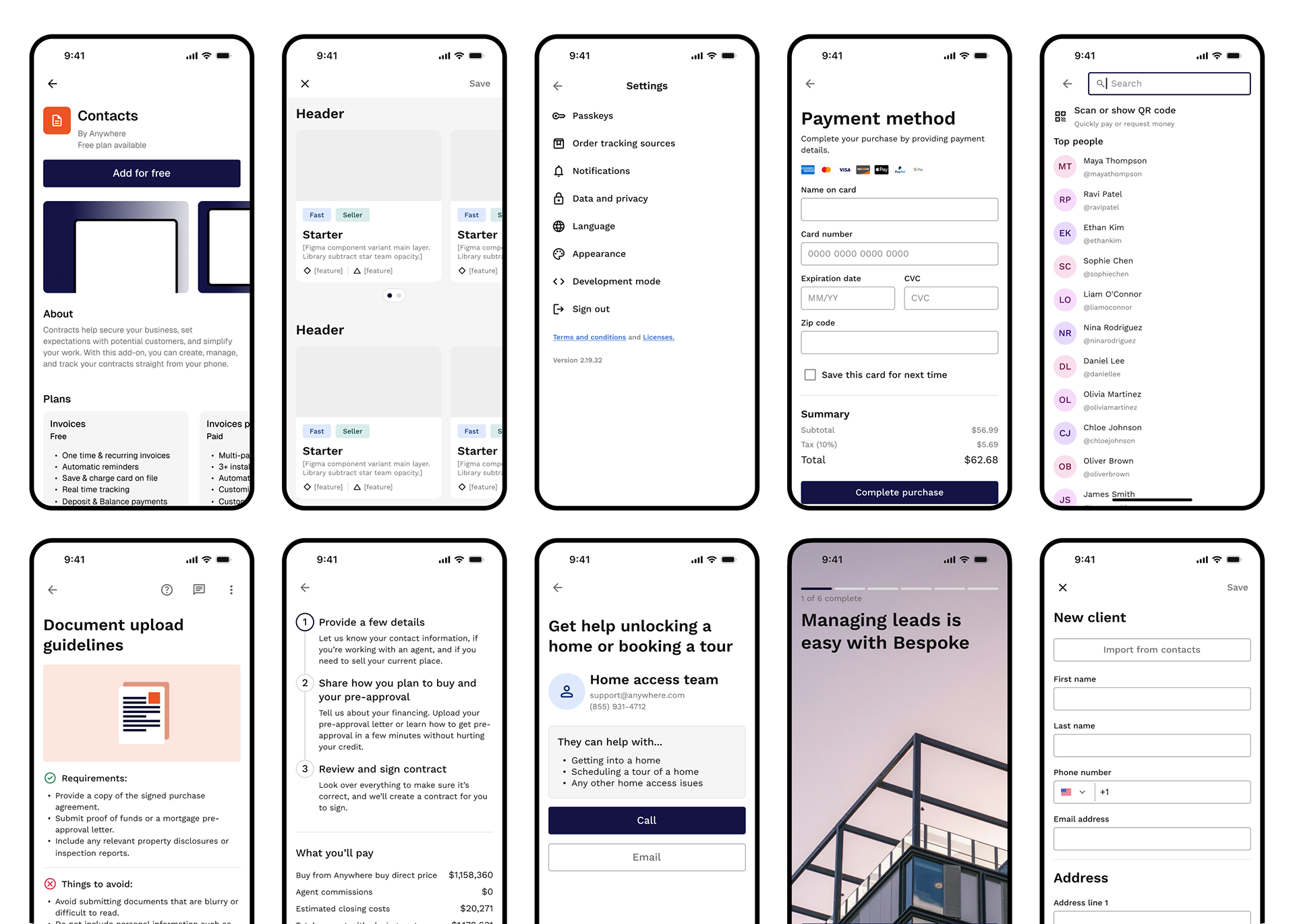
Screens built with Bespoke components
Phase 1: Font analysis
Below is the font analysis, where I looked at 50+ fonts and chose one by analyzing a set of criterias so the choice wouldn't come down to personal choice for a type foundation. I compared ten sans-serif families against weight range, licensing, language support, and the three legibility tests that matter most in a data-heavy product: the shape of a/c/e/o, the disambiguation of I/l/1, and the distinction between a capital O and a zero. I built it all into a single comparison table, so the team could reason through the decision together.
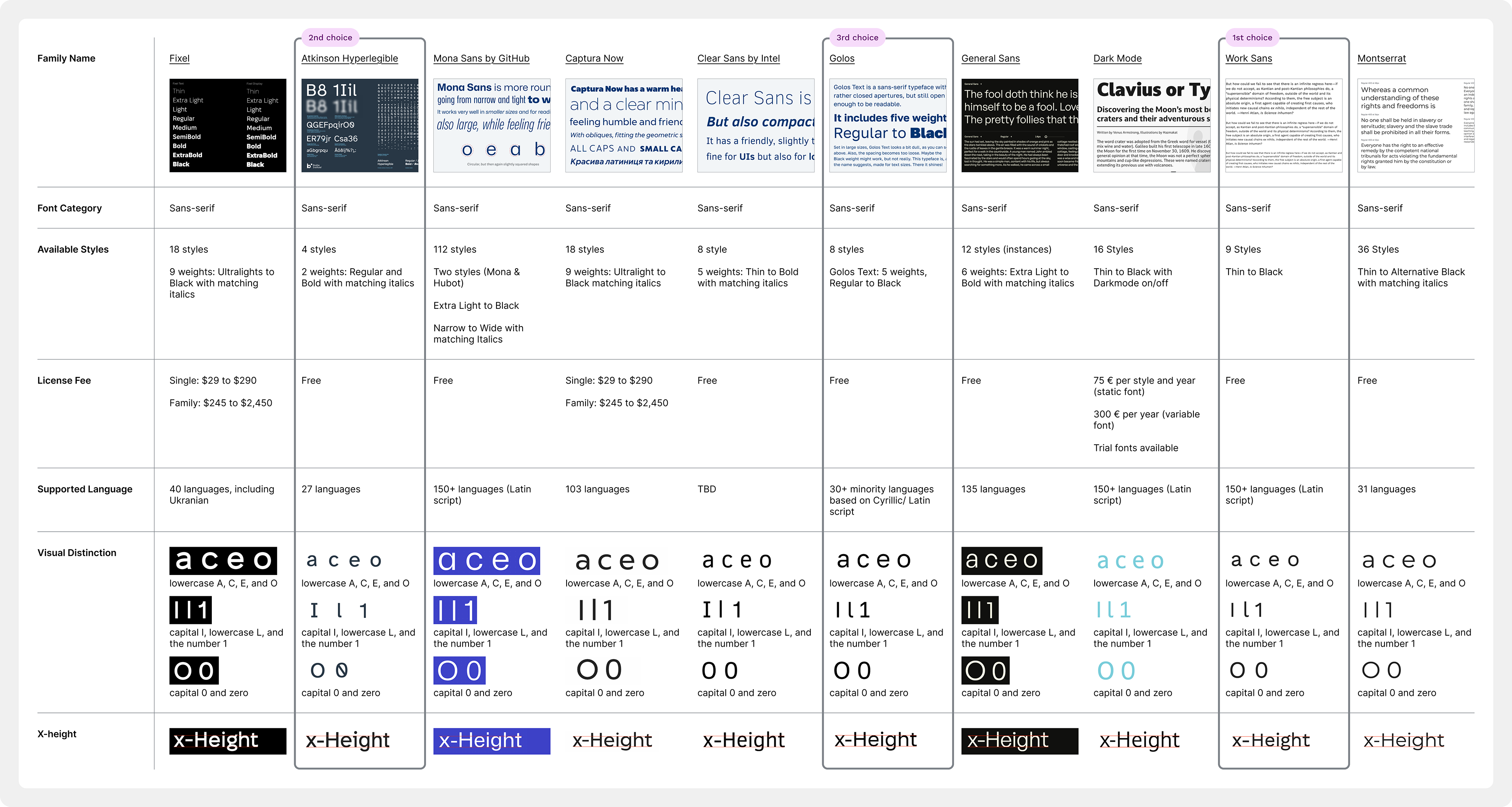
Font analysis with the top 3 choices identified
I recommended Work Sans for its range: nine weights the system needed to cover both enterprise and consumer products. The team was divided because Atkinson Hyperlegible had the clearest letterforms of anything I tested, including a zero you could never mistake for an O. But two weights couldn't carry a full type scale, and that lack of range would have forced workarounds later. The table made the tradeoff visible enough to decide on. The team adopted Work Sans.
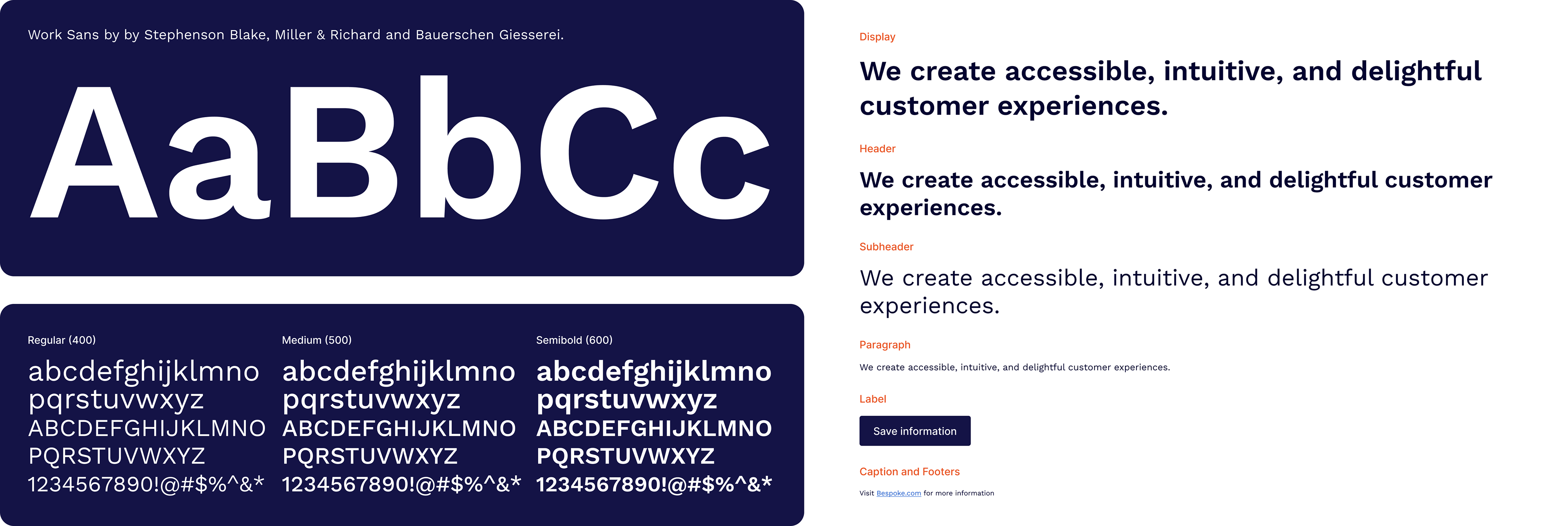
Font weight (left), font hierarchy (right)
Phase 2: Launch and adoption
The system side
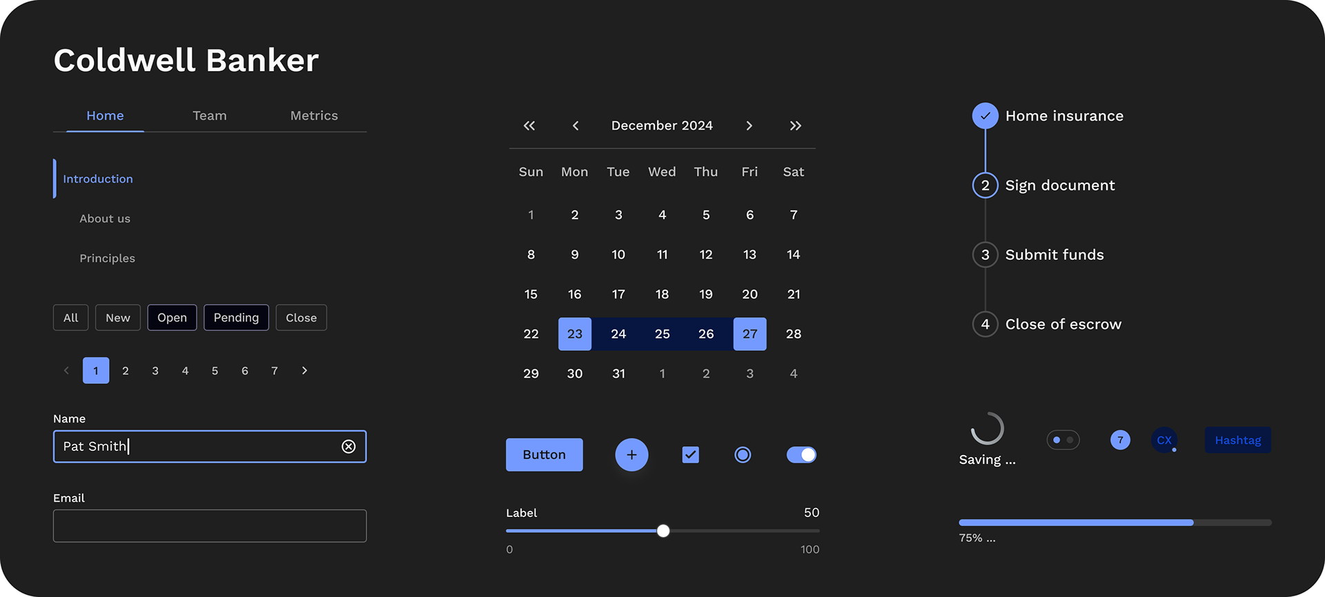
I created dark themes for 7 brands, managed the icon library, and designed the Bespoke logo and visual language. On the documentation side, I worked with the lead designer to build the documentation site from the ground up. I owned the information architecture, graphics, and page content, drafting and editing with AI to move faster while keeping my editorial judgment and structure.
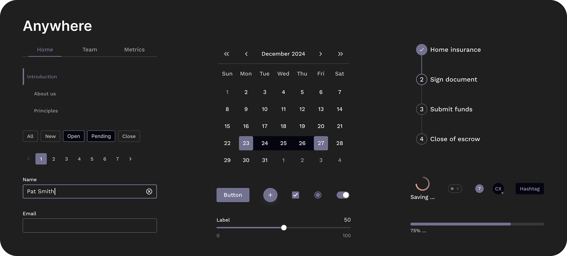
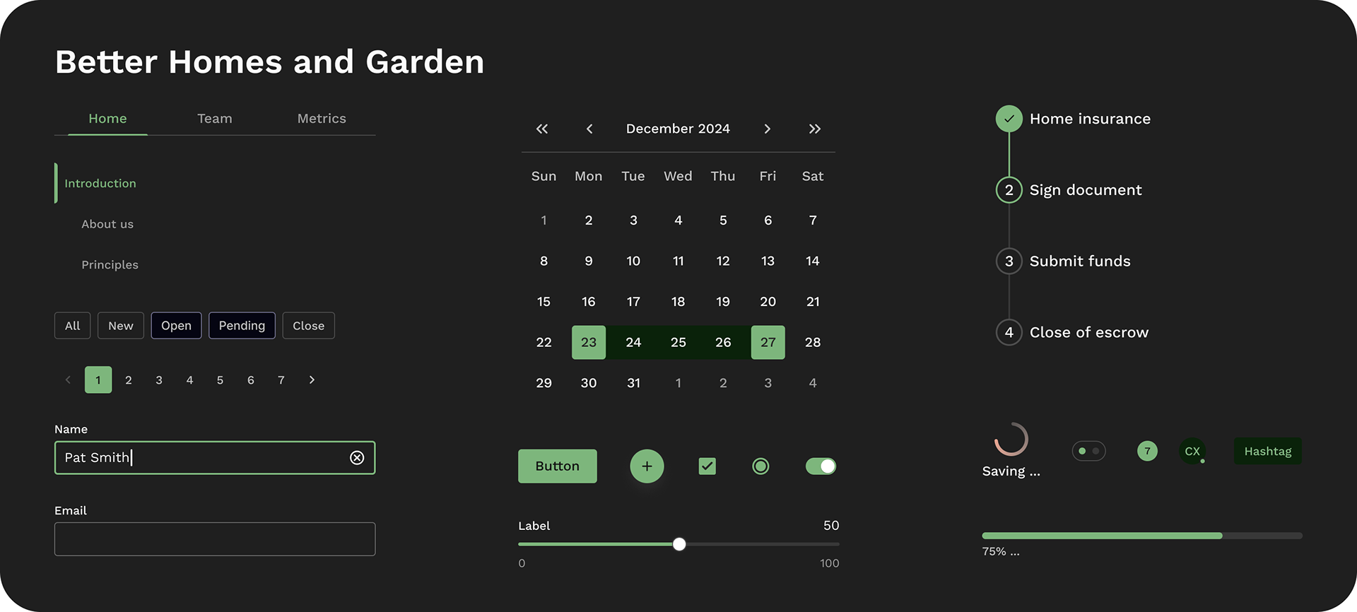
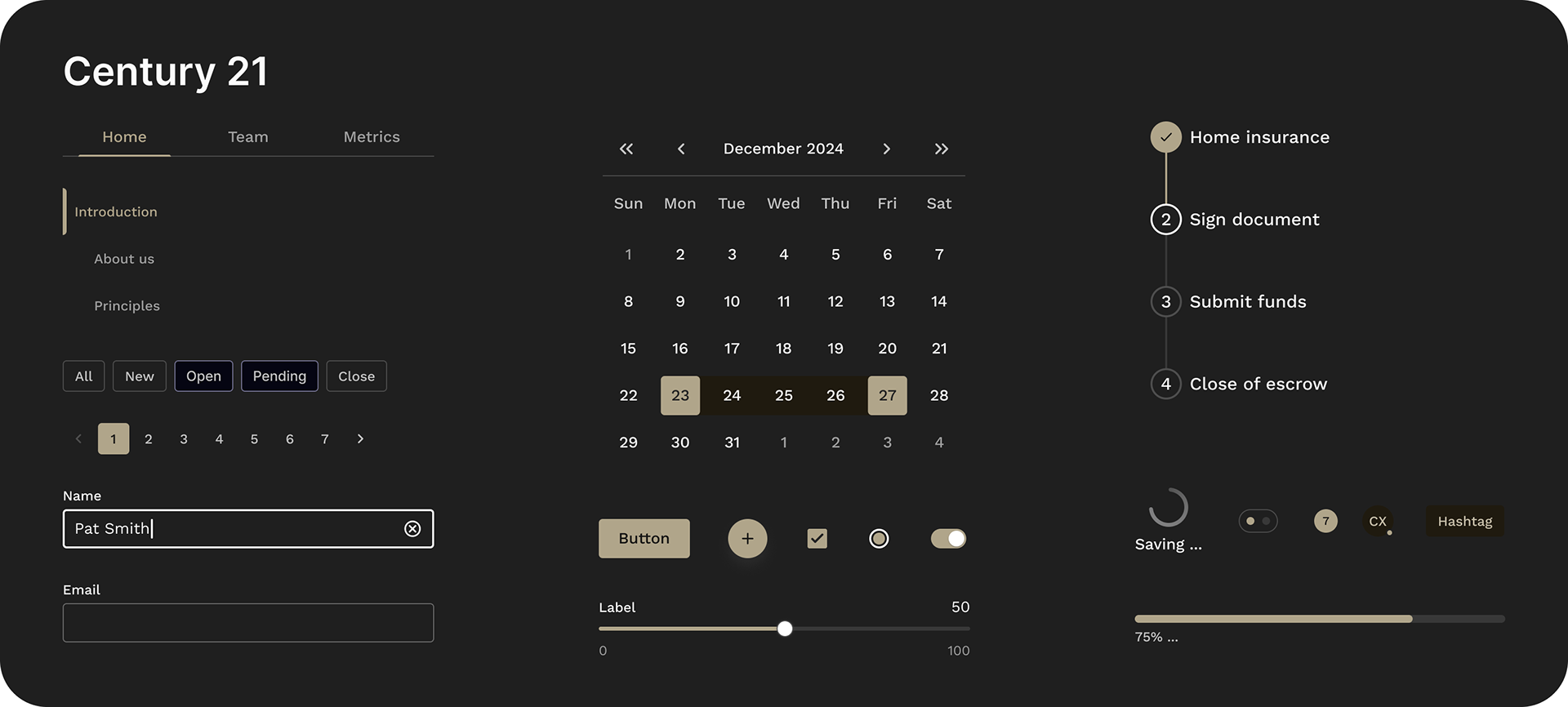
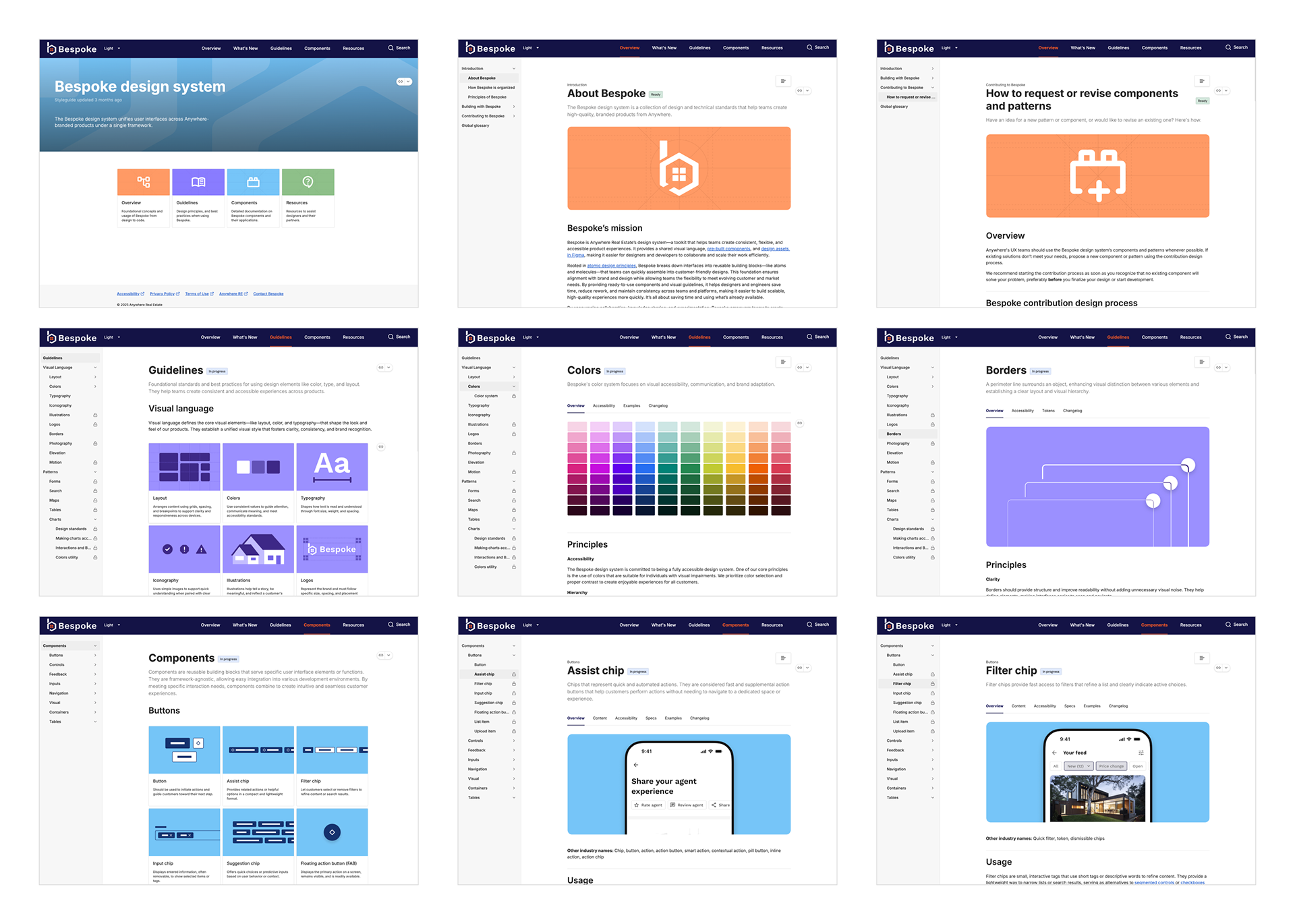
Bespoke's documentation website
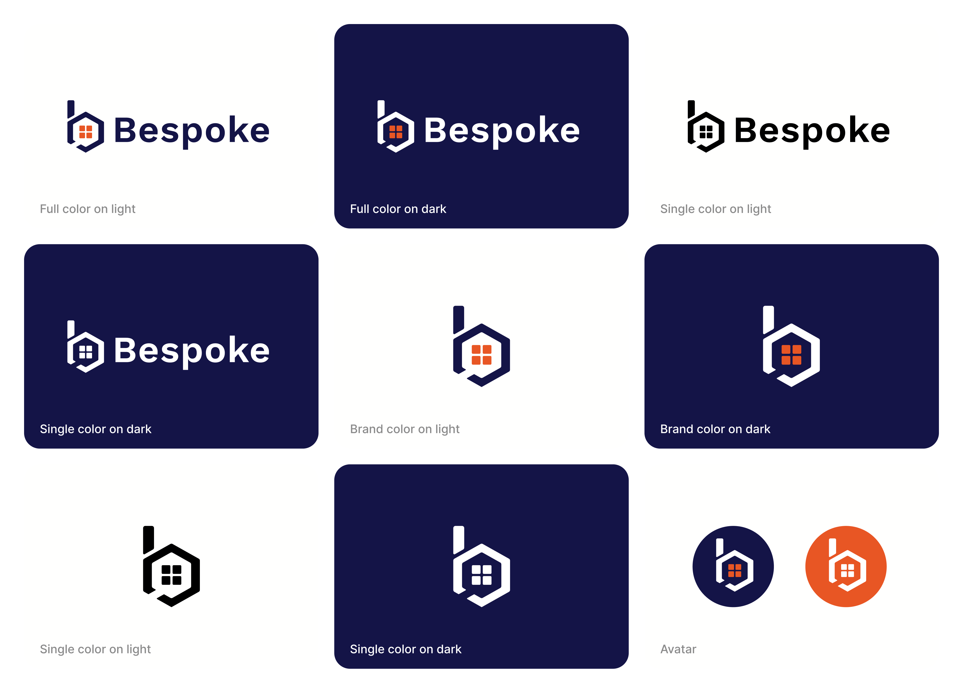
Bespoke logo
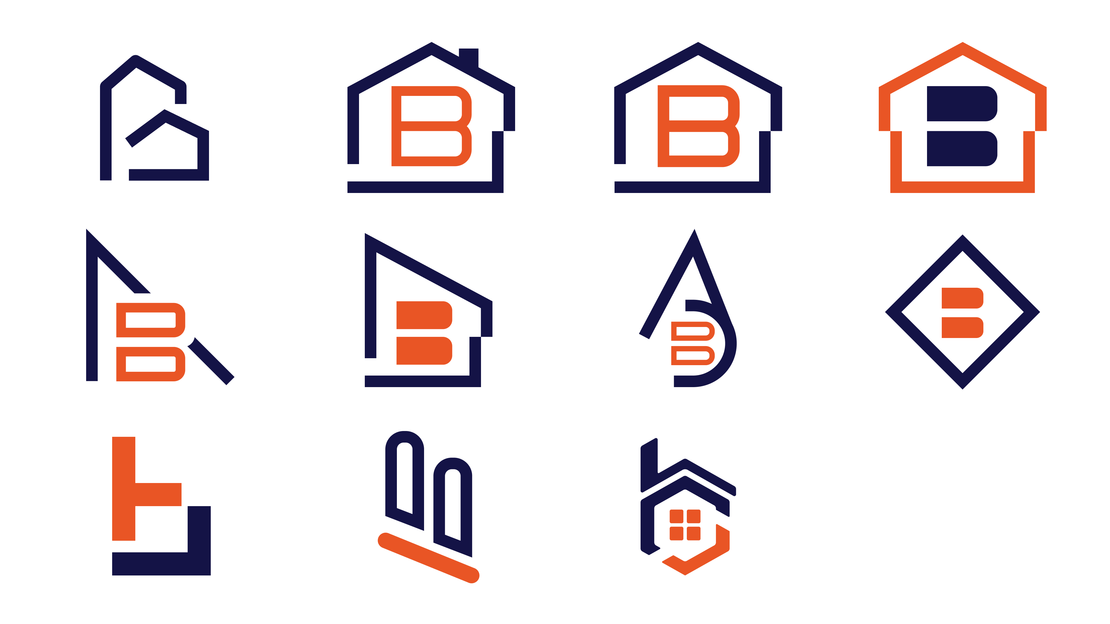
Some explored areas
Organizational side
As Bespoke grew, a lot of the change requests were driven by taste rather than need. A designer had seen a treatment in another design system and wanted it in ours, but they didn't have evidence, and a system that changes based on preference stops being a system.
Our tag component was one example. Tags used a 4px corner radius, the same as every other component. Designers started asking for a pill shape, mostly because other systems had it, and argued the squared tag looked too much like a button. But the tag isn't interactive, so button-like affordances would have made it less clear, not more, and it broke the consistency the rest of the system relied on.
Individually, the request is minor. The problem is that saying yes once makes it harder to say no to the next fifty. So I proposed a change process: updates had to be backed by evidence, not preference.
We were a team of two supporting 22 designers and couldn't run discovery for all of them, so I made each product team's existing UX research the input for system changes. That kept updates grounded in real data without turning us into a bottleneck. It also depersonalized the disagreement. A change either met the evidence bar the team had agreed to, or it didn't, which made the conversation easier to have twenty-two times over.
The process was published to the documentation site.
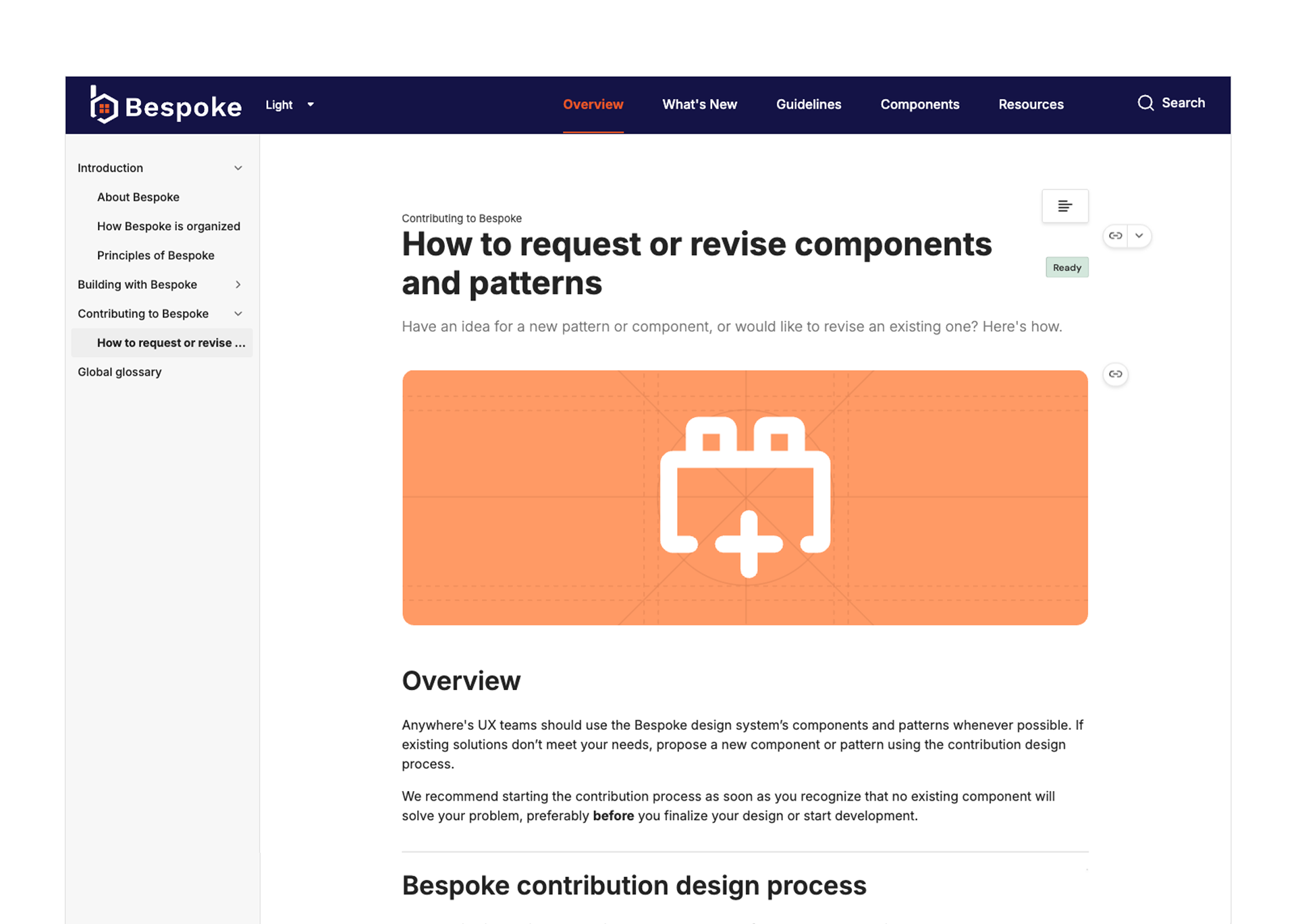
Change process page
Phase 3: Bringing patterns back to the library
As the system matured, product teams had built patterns using existing Bespoke components. These patterns were living in individual product files rather than the shared library, which meant other teams couldn't reuse them without rebuilding from scratch, duplicating work at both the design and engineering level.
I collaborated with the lead of each pod to identify which patterns were worth migrating. Not everything qualified. The criteria were how frequently a pattern appeared across products and whether it solved a problem that multiple teams had independently identified. If different teams had built the same solution without knowing about each other, that would have been a strong signal that the pattern belonged in the shared library.
From there, I audited each pattern, rebuilt where needed to match Bespoke's style and naming conventions, and created Jira tickets so developers could incorporate them into the code library.
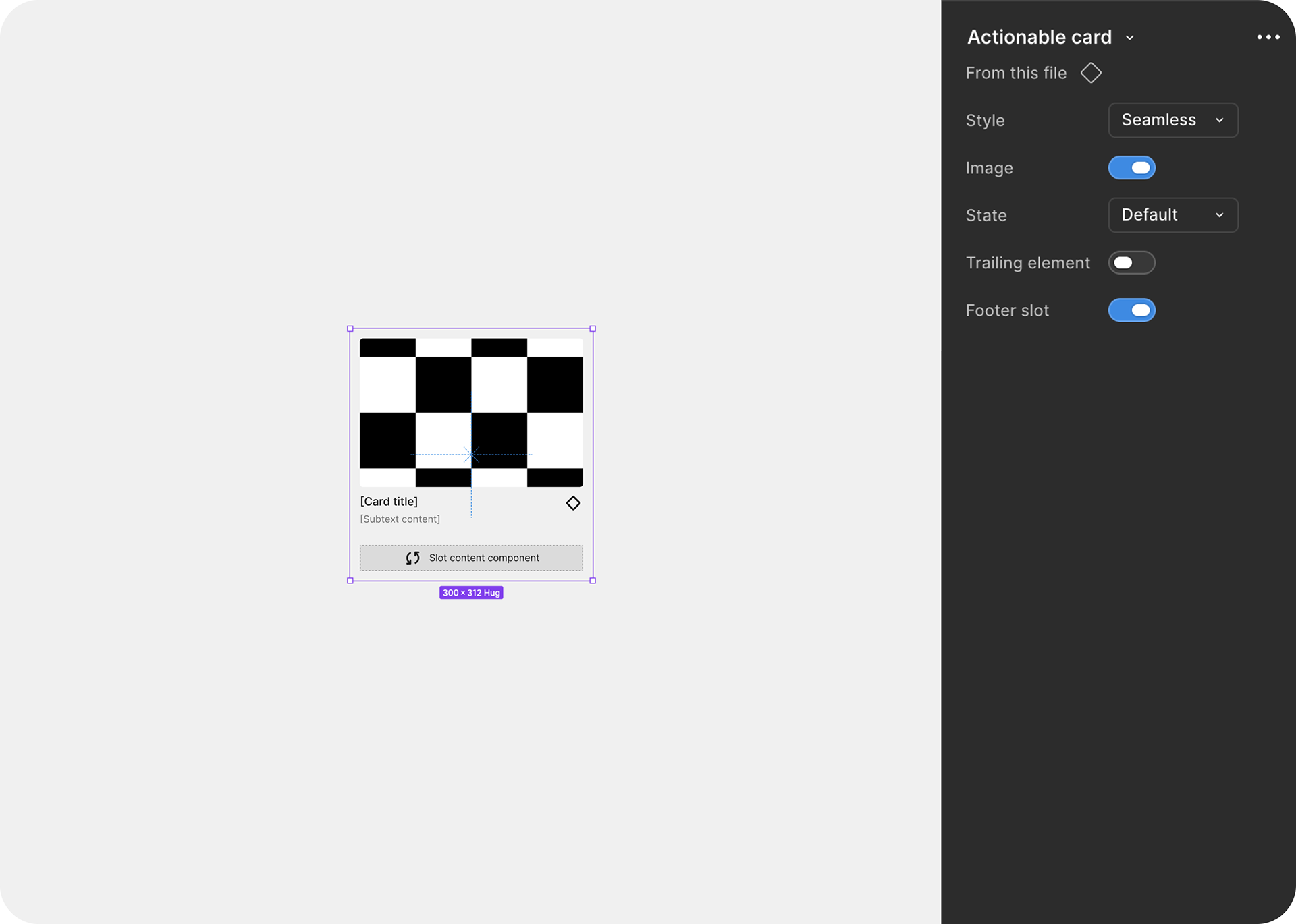
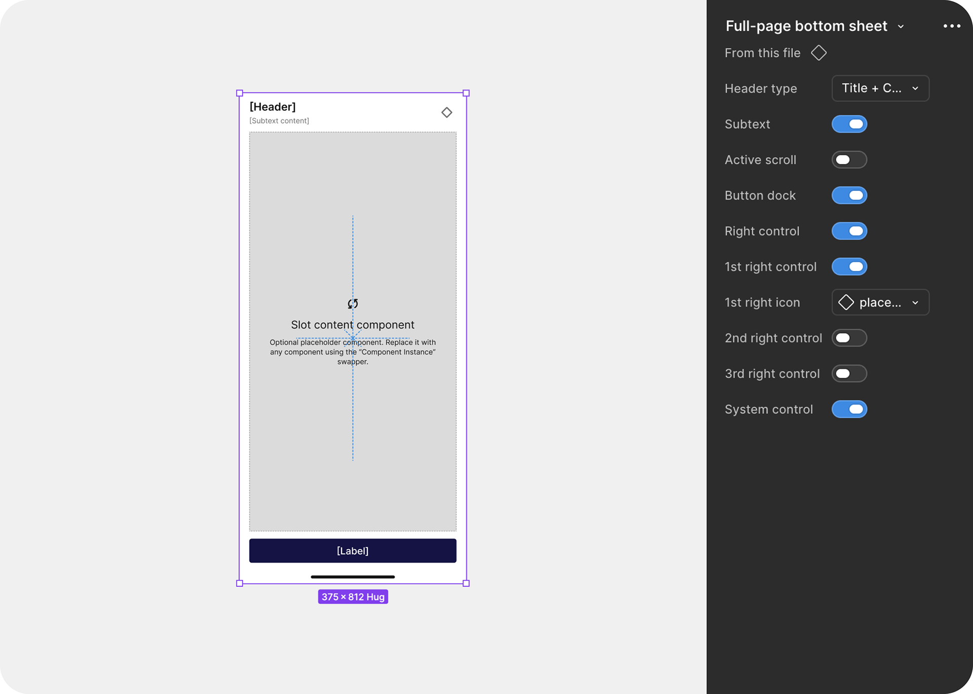
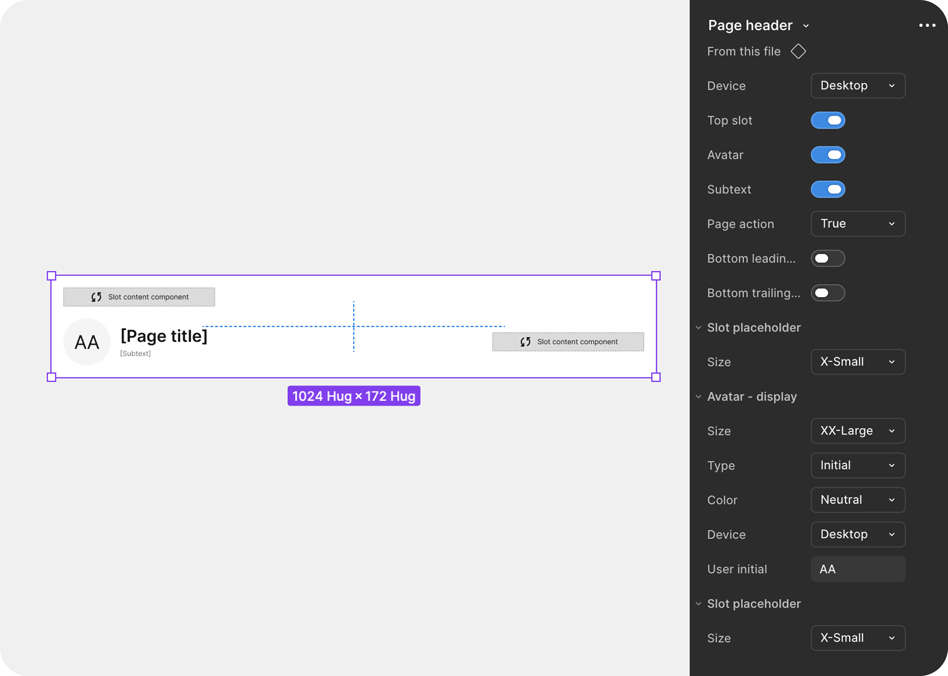
Outcome
Bespoke consolidated seven separate systems into one. Seven brands now theme from a single token architecture instead of maintaining separate, drifting libraries, and 22 designers work from one source of truth instead of five competing ones: one dark mode, one change process, one centralized documentation site. Instead of digging through PDFs to find a hex code or rebuilding a component that already existed somewhere else, designers could reach for a pattern that was already governed, themed, and documented.
My manager and I ran intake, taking requests and ensuring the system held up across all teams using it. The result wasn't just consistency but also freed designers to focus on solving product problems instead of maintaining their own components or second-guessing guidelines.
What I learned
A design system is only as strong as the organization's willingness to maintain it. The hardest part of this work was never the components. It was helping people understand why consistency has value when freedom feels easier.
If I were doing it again, I would surface the governance earlier. We built the components first and the process second, and a lot of the early pushback traces back to that order. Deciding how a team makes decisions together turned out to be the actual product.