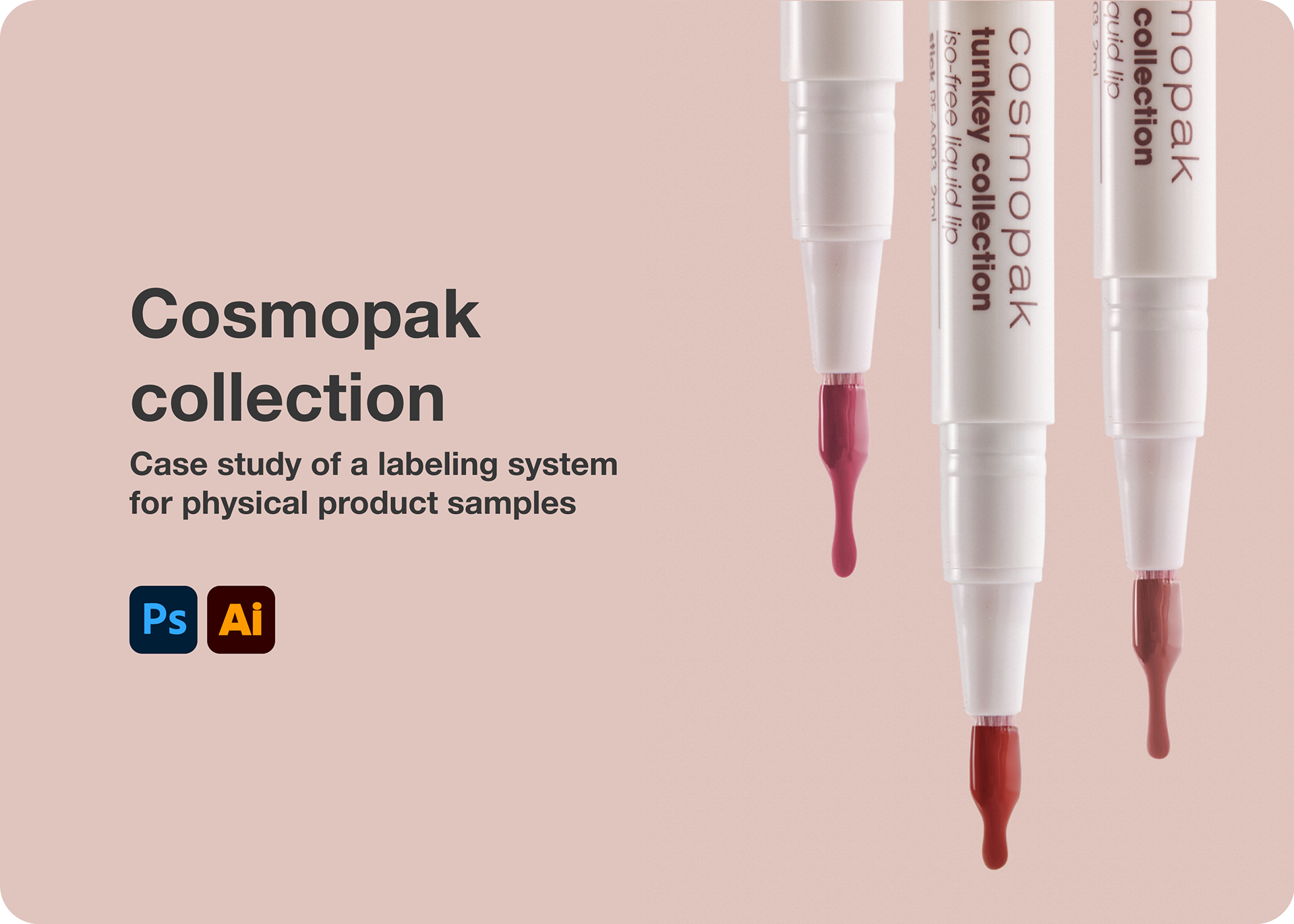
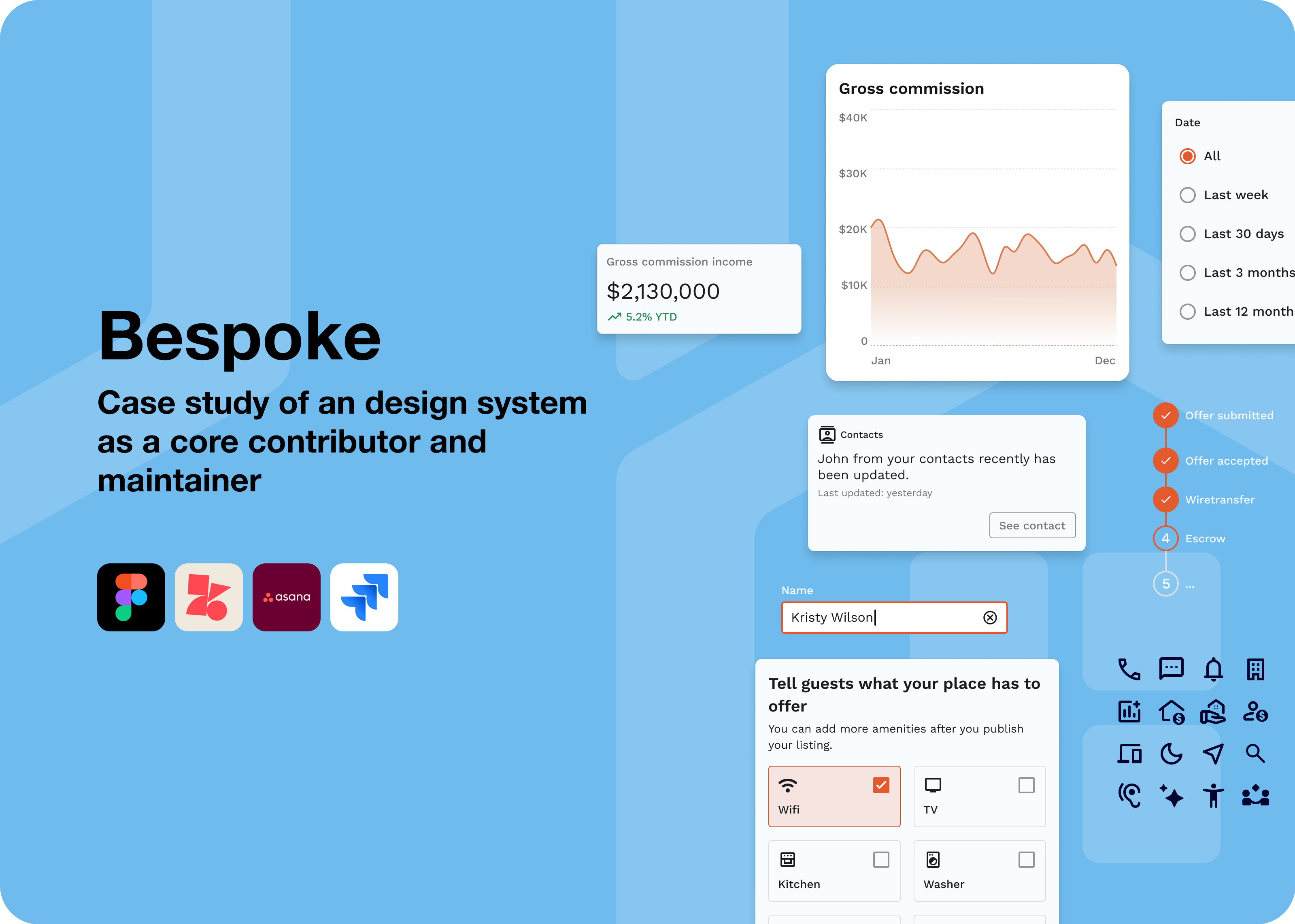
Projects / Dark mode

Overview
Anywhere Real Estate’s design system served both enterprise and consumer-facing products across multiple brands. Competitive products had dark mode, and there was internal pressure to offer it as well. A partial dark mode existed when I picked up the project, but it varied significantly across products and approaches. Some products keep their brand colors identical across light and dark modes. Others wash out CTAs to a pastel tone. Some invert backgrounds to a dark blue rather than near-black. There was no consistent logic tying it together, and what existed wasn’t ready to ship.
My contribution
Market research
Product design
Documentation
The team
1x product designer
1x lead designer
1x accessibility
3x front-end engineers
The process
I started by researching how other products handled dark mode, looking at how they adapted backgrounds, component states, and brand colors. That research gave me enough signal to develop a formula rather than making color decisions one by one.
Grayscale
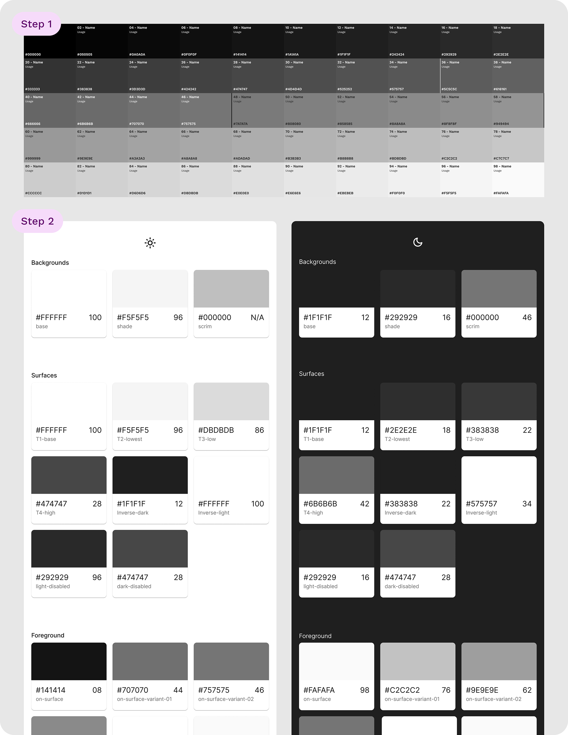
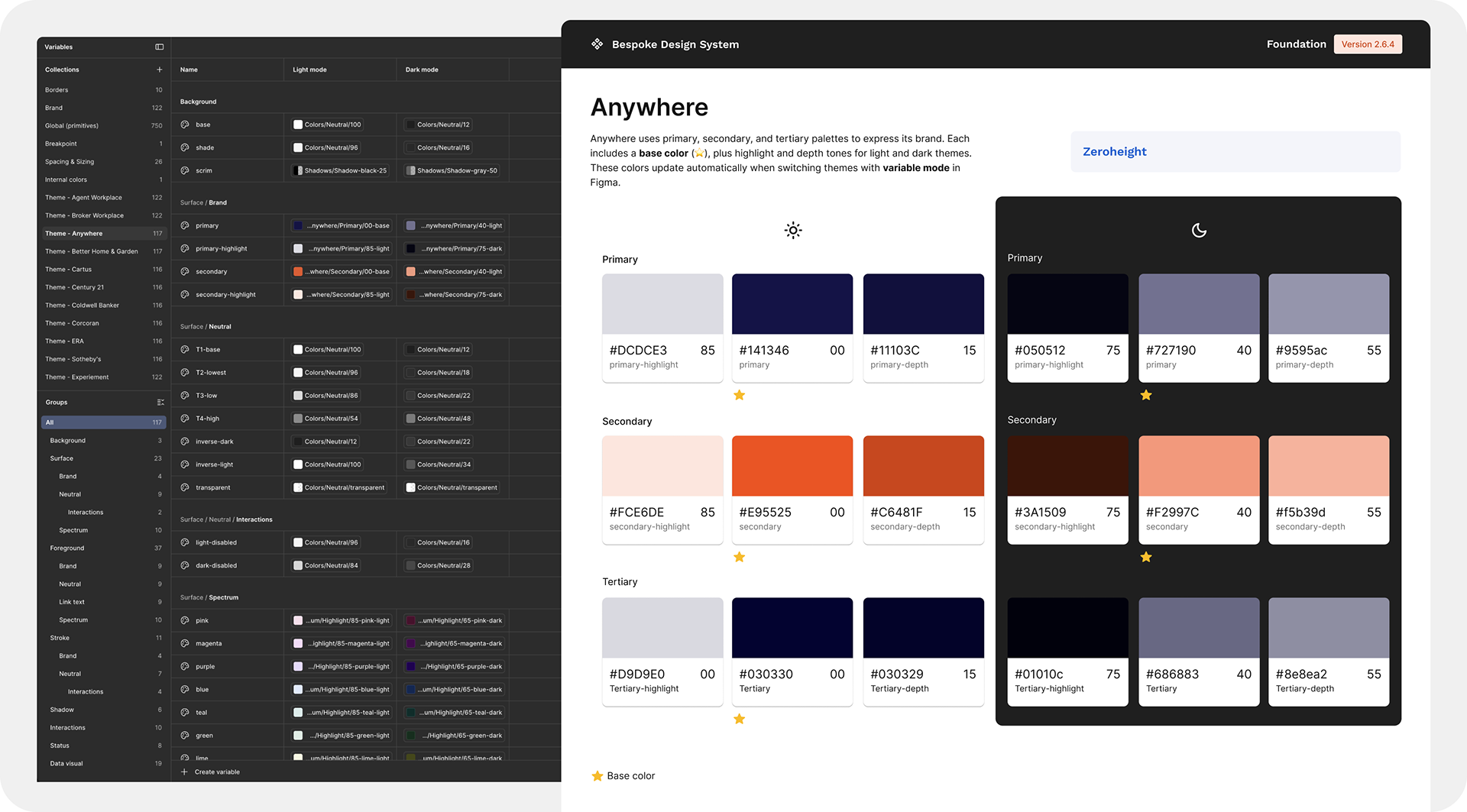
I applied an inverse method rooted in a simple principle: everything light becomes dark. The mental model is similar to how we experience day and night. In daylight, colors appear at full brightness. At night, the same colors are still visible but more muted, darker, pulled back. Pure black was avoided, and the inversion used the same 5% increment logic the lead designer had established for light mode (as shown in the step 1 image below), so the relationship between surface levels remained consistent across both modes (as shown in the step 2 image below).
Brand colors
I followed the logic of washing out CTAs slightly in dark mode, shifting them toward a softer, less saturated version of themselves. This logic is a common pattern because deep brand colors don’t provide enough contrast against dark backgrounds to signal interactivity. The washed-out versions preserved the brand color family while giving the button enough visual weight to do its job.
I tested every color combination for contrast before finalizing anything. Backgrounds against text, text against surfaces, icons against backgrounds, and interactive states across all components.
The consumer brand issue
The enterprise products were new, with their identities still developing, so color decisions had greater flexibility. Consumer brands were a different situation. Two of six consumer brands used bright colors that didn’t meet contrast requirements in dark mode. The lead designer proposed alternative colors for those brands, but any change to an established brand color requires the brand's approval. Brands are protective of their colors because they affect everything from packaging to marketing materials, not just the product. The lead designer decided to put the consumer dark mode on pause while the approval process played out. The remaining four consumer brands and all enterprise products launched on schedule.
The Figma implementation
Once I established the formula, I applied it systematically across the system. I mapped the color tokens so that designers could switch any screen between light and dark mode without touching individual components. What would have been a manual, component-by-component process became a two-step toggle in Figma. Both enterprise and consumer products were able to adopt dark mode at launch.
Outcome
Dark mode shipped across the enterprise products within three months. The token structure meant designers could work in dark mode immediately without additional setup, and the formula made it straightforward to extend to new components as the system grew. The consumer dark mode remained paused pending brand approvals for the two affected brands, with the other four ready to go once the system-wide rollout resumed.
Reflection
The most interesting problem was the CTA color logic. There is no single right answer for how to handle brand colors in dark mode, and different products make different tradeoffs. The decision to wash out the CTAs was grounded in UI logic: you need contrast to signal interactivity, and a dark brand color on a dark background doesn’t provide it. But it’s still a judgment call, and one that required buy-in from the lead designer before moving forward.
The consumer brand situation was a good reminder that design system decisions don’t exist in isolation. A color that works perfectly in product design can still be blocked by brand governance processes operating on a completely different timeline. Getting the enterprise products out first was the right call. It proved the system worked and gave the consumer brands something concrete to react to.