Projects / API access form
Overview
Internal and external developers used the API intake form to request access to Anywhere Real Estate's APIs. The form existed but wasn't working. Vague questions, a disjointed flow, and a lack of context at the point of selection were driving a steady stream of follow-up messages, pulling the API team away from building. The PM brought the project to me, and we scoped it together.
My contribution
Product design
Icon design
Content design
The team
1x product designer designer II
1x product manager
1x senior architect engineer
3x back-end engineers

The problem
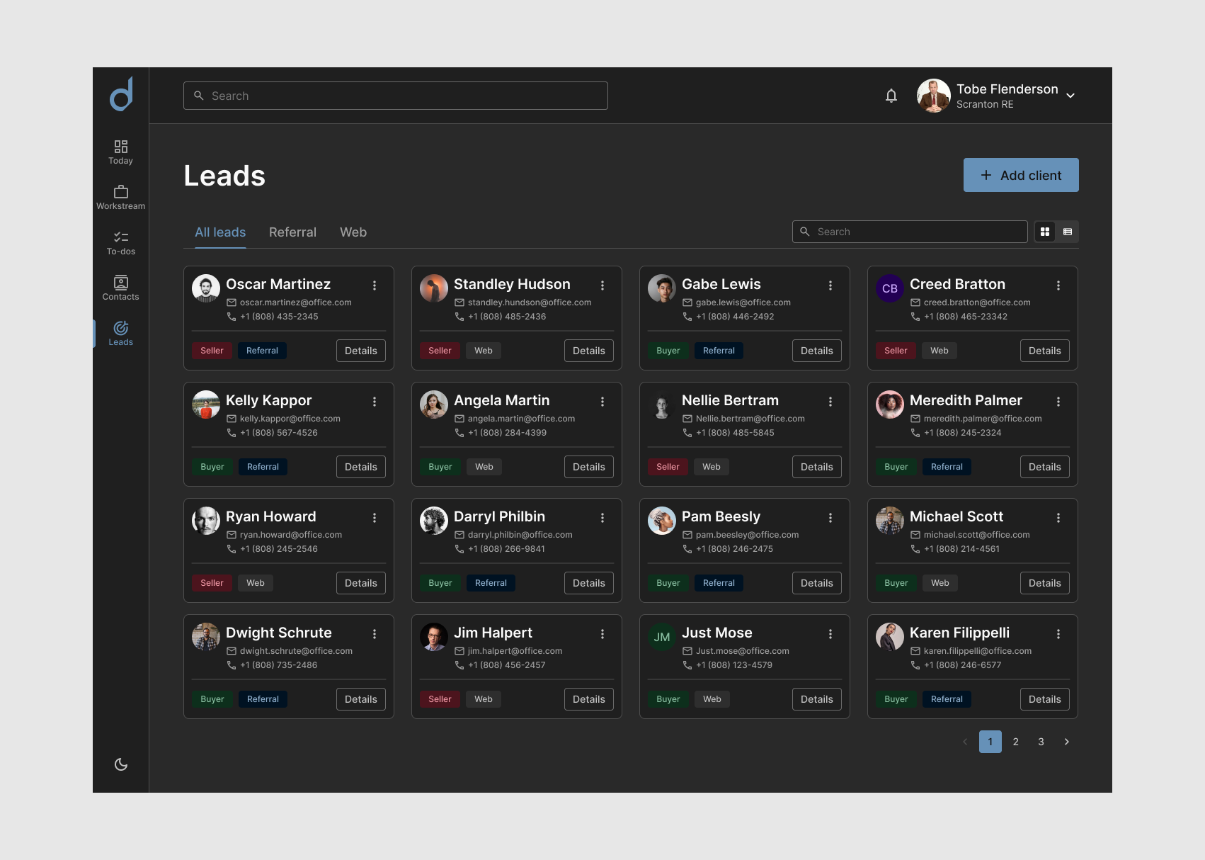
The form showed the selected API on the first step, but once users moved forward, that information disappeared. With three steps to complete and developers typically working across multiple tabs, losing sight of which API they had selected was easy and costly. Sub-APIs had no descriptions, leaving users to guess. The dashboard path required completing a separate form first, with several questions repeated across both. The API team was fielding follow-up messages from internal developers via Teams and external developers via a website help form, taking time away from the work they were hired to do.
Constraints
The manual review process stayed in place by design. The APIs contained proprietary data, so all submissions required identity verification before access was granted. Internal users went through a quicker review. The approval experience itself was outside the scope of this project.
What I tried and threw away
A question came up around icons. The portal used generic placeholder icons for APIs without unique ones, which looked like unfinished mistakes. I wanted to know if users relied on them for navigation before deciding whether to invest in better ones. They didn't. Removing them was the right call. Design should be intentional, and anything that doesn't add value is just noise.
The redesign
The form needed reorganization more than a complete rebuild. Vague questions got clarified. Out-of-sequence questions got moved. Redundant fields were consolidated.
On the UI side, full-width fields were replaced with a narrower container. Form field width should reflect the expected length of input, and full-width fields for short answers create unnecessary eye movement. Most products cap the width of their form container for this reason.
The layout introduced a split view: the form on the left and an API card on the right, showing the selected API across all three steps. Sub-API descriptions were added so users could evaluate options without leaving the page. Returning users had most fields pre-populated. First-time users had more to fill in, but with clearer sequencing. After submitting, users landed on a confirmation page explaining what to expect next. From there, they could return to the dashboard or close the tab. Both internal and external users could track status from the dashboard via the left navigation or a home screen status banner.
Outcome
The form shipped and is still in use. User testing feedback: the new design felt "more intuitive and quicker to finish. The older one wasn't bad and was also quick once you got used to it." The old form had a learning curve. The new one didn't require one. Follow-up messages from developers decreased over the months after launch.
Reflection
The icon finding was a small moment but an important one. It’s easy to keep design elements because removing them feels like a regression, and it's often met with resistance. But if users aren’t relying on something to navigate or make decisions, its presence creates visual noise without adding value. Research helped the team understand that any previous design decisions that need updating require evidence rather than subjective claims.
The harder balance was deciding how much information to collect upfront. A lighter form felt easier to complete, but asking for too little meant the dev team would need to follow up to get what the team needed to create the access packages. I worked closely with the dev team to find the right amount, enough for them to act without back-and-forth, but not so much that it added unnecessary friction for the user.