Projects / InMod Trade
Overview
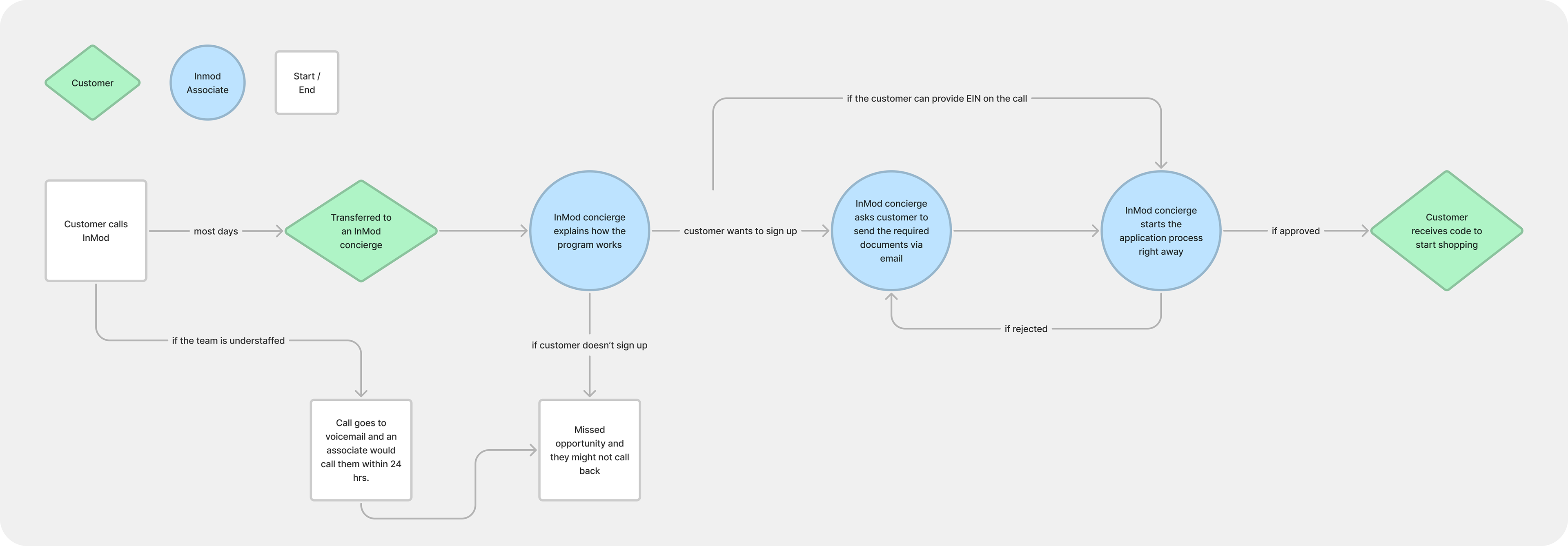
Inmod's trade program served interior designers and industry professionals with exclusive pricing and access. It was the company's highest-revenue channel. To join, applicants called a dedicated associate who walked them through registration over the phone.
On paper, that sounds attentive. In practice, it meant one person was responsible for every application, start to finish. She also took trade orders, answered questions about materials, and prepared swatches for clients. The phone registration process alone was taking her up to 45 minutes per applicant, and that wasn't just the call. It was the back-and-forth: waiting for customers to locate and send proof of credentials, following up by email when verification stalled, calling again if something was missing. When she was unavailable, calls went to voicemail. Applications waited.
My manager flagged this as a problem worth solving. I started by mapping out everything that made it hard for the applicant and for her.
My contribution
Digital designer
Icon designer
Content designer
The team
1x digital designer
1x social media manager
1x marketing manager
1x program manager
Mapping the problem
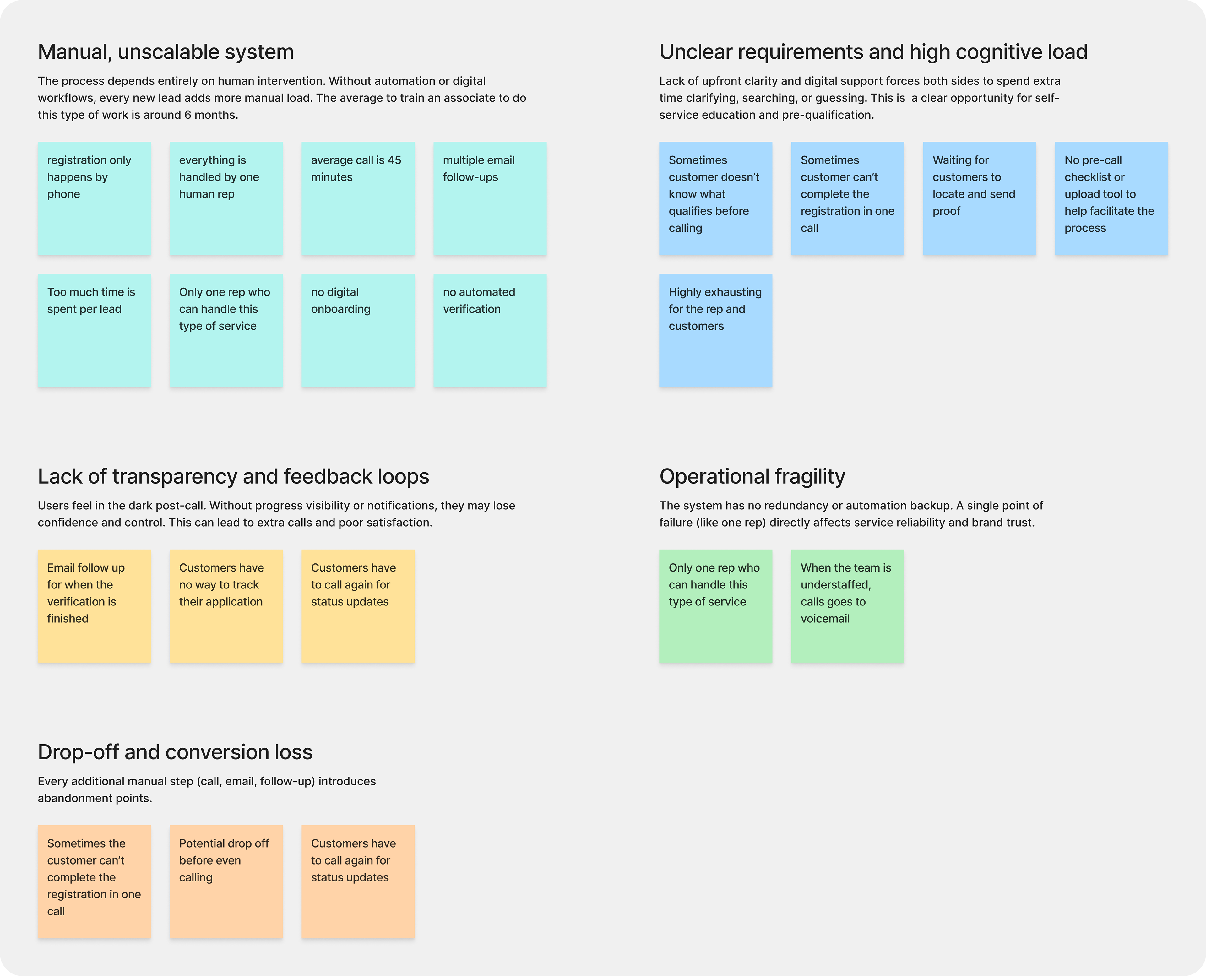
I reviewed feedback from applicants and talked with the associate to understand what the process looked like from both sides. The pain points fell into two clear groups.
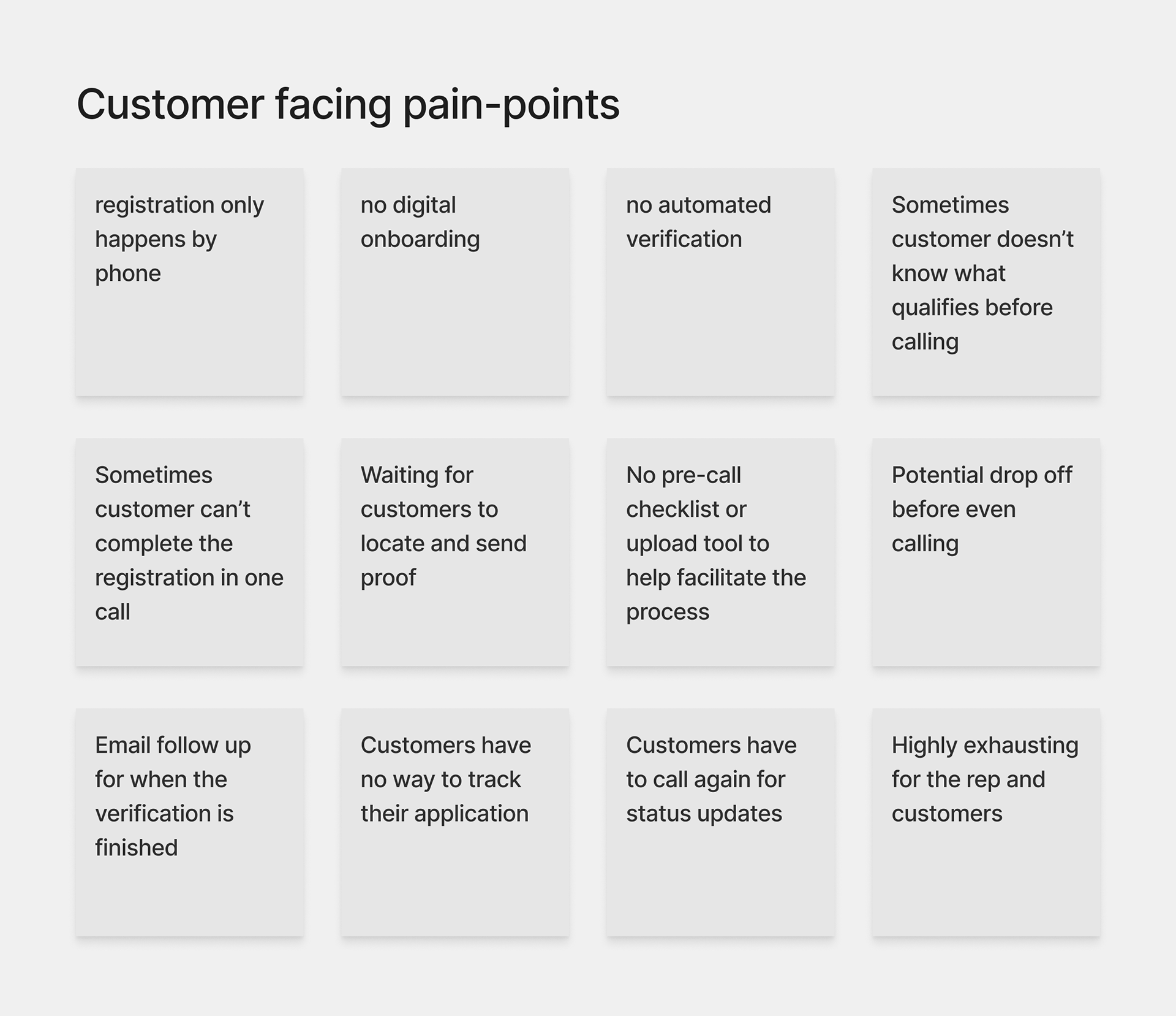
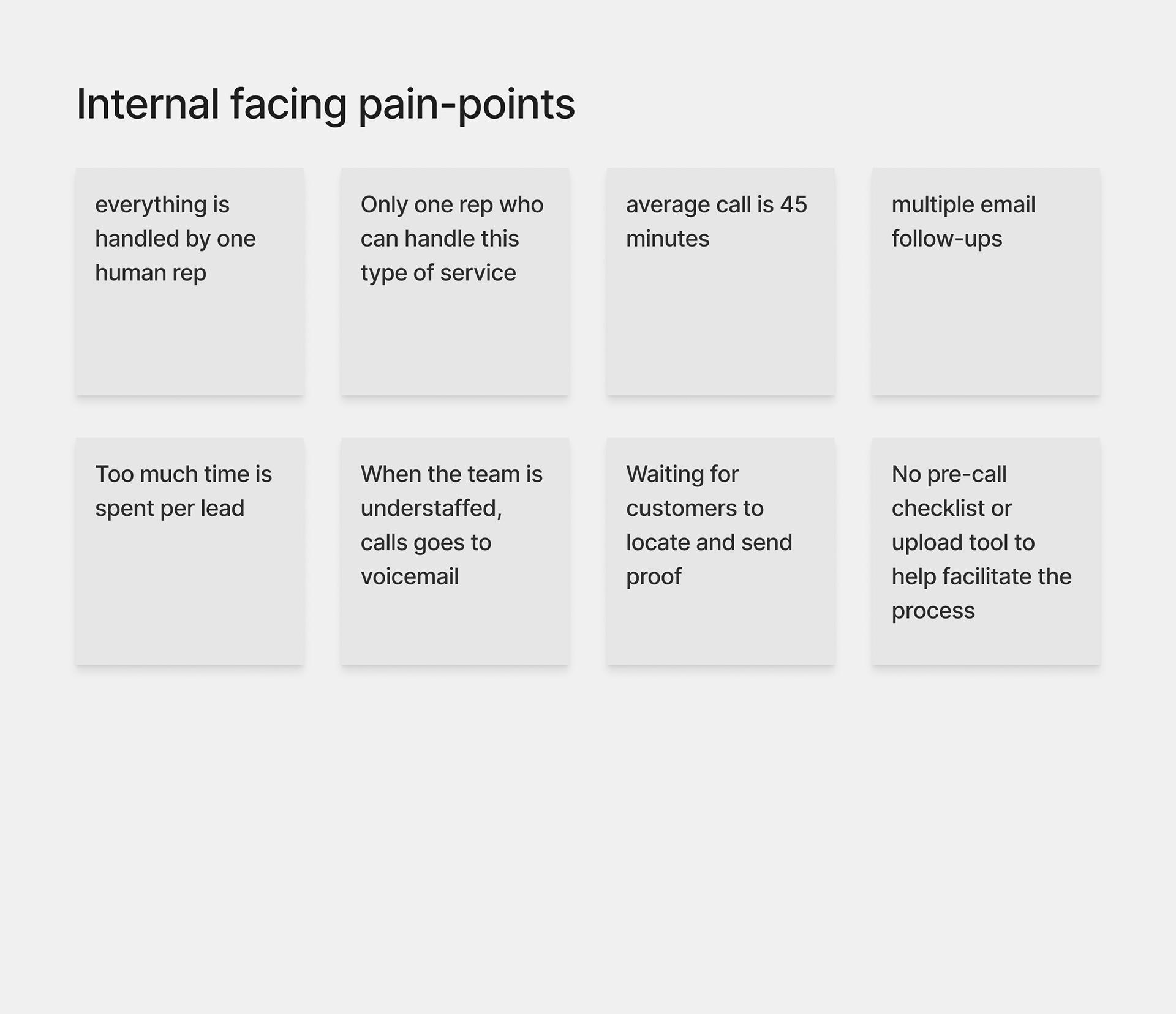
The phone call was a workaround for a missing system. Everything that made it slow, stressful, and dependent on one person's availability could be addressed with a better-designed process.
The constraint that shaped the solution
Inmod didn't have a budget for automated credential verification. That was a real constraint, and I didn't design around it. The human review step was staying. The question was how to make it faster, less dependent on real-time availability, and less likely to stall.
That reframe changed what I was designing. The goal wasn't to remove the associate from the process. It was to give her better tools so she wouldn't be the bottleneck.
The redesign
Customer-facing: a self-service registration form
I redesigned the registration as a multi-step digital form that applicants could complete on their own, on their own time.
Step 1: Business information. Name, company, role, contact details. The fields the associate was collecting by hand over the phone.
Step 2: Credential upload. Applicants uploaded proof of their professional status, such as their business license, designer credentials, or equivalent documentation, directly through the form. No emailing attachments after the fact. No waiting for someone to request them.
Step 3: Review and submit. A summary screen lets applicants confirm their information before submitting.
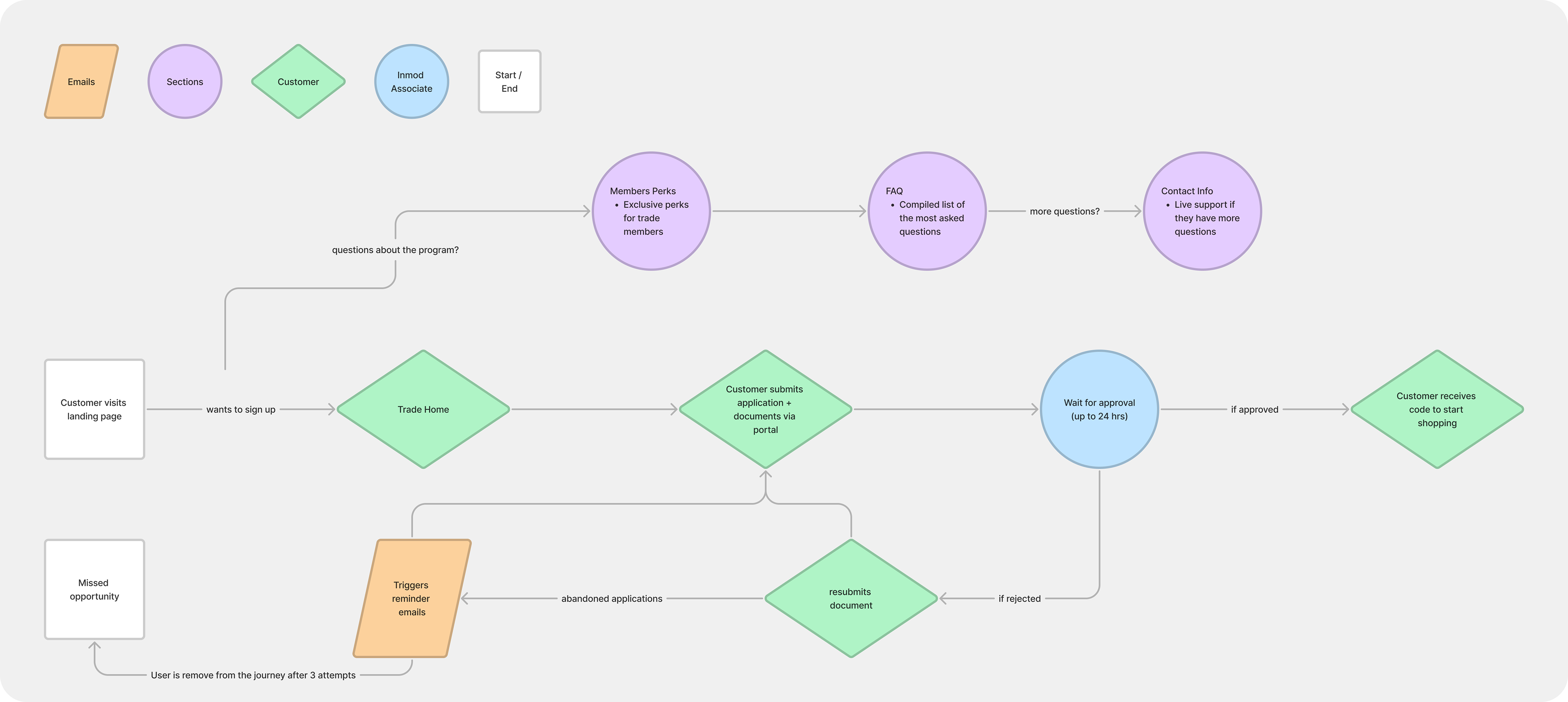
If an applicant abandoned the form partway through, a re-engagement email gave them a direct link back to where they left off. If documents didn't pass review, a re-upload flow let them correct and resubmit without starting over.
Internal: applications in Salesforce
Incoming applications surfaced in Salesforce, where the associate could review submitted documents without sorting through email threads or phone notes.
Automated email sequence
I replaced the manual communication that had been happening ad hoc during calls with a trigger-based email sequence:
Abandonment email: sent to applicants who started but didn't finish, with a direct link back to their form
Submission confirmation: sent immediately on submit, with a reference number and expected review timeline
Delay notification: sent if verification was taking longer than expected, so applicants didn't have to call to find out where things stood
Approval notice: sent when the application was approved, with a direct link to start shopping
Outcome
Onboarding time dropped from 45 minutes to 5 minutes.
Handoff
I left the company while the project was still in progress. I completed and handed off all design files before leaving. The live experience reflects changes made after handoff and does not match the original designs. The process work and the files are mine. What shipped after I left is not.
What I learned
The constraint I found most interesting was the verification problem. Not having a budget for a third-party service felt like a limitation at first. Still, it pushed me toward a more honest solution: don’t try to remove the human step; just make it faster and less dependent on one person’s availability. The re-upload flow and the email sequence both came from accepting that constraint rather than designing around it.
The abandonment email was one of the highest-impact pieces. Drop-off in a multi-step form is predictable, and giving applicants an easy path back.