Overview
Nestlé Health Science's email system was built to replace a slow, agency-dependent process with something the in-house team could run on its own. Before the new system, BOOST's emails were heavily image-based, which meant the message disappeared for anyone with images disabled, while the Nestlé Nutrition Store's emails were plain text with no real design at all. I ran a heuristic evaluation across both, designed a modular block system to fix the gaps, and worked through real production constraints, including a last-minute file format mismatch with the agency and a string of Outlook rendering bugs, to get it live across multiple brands.
The problem
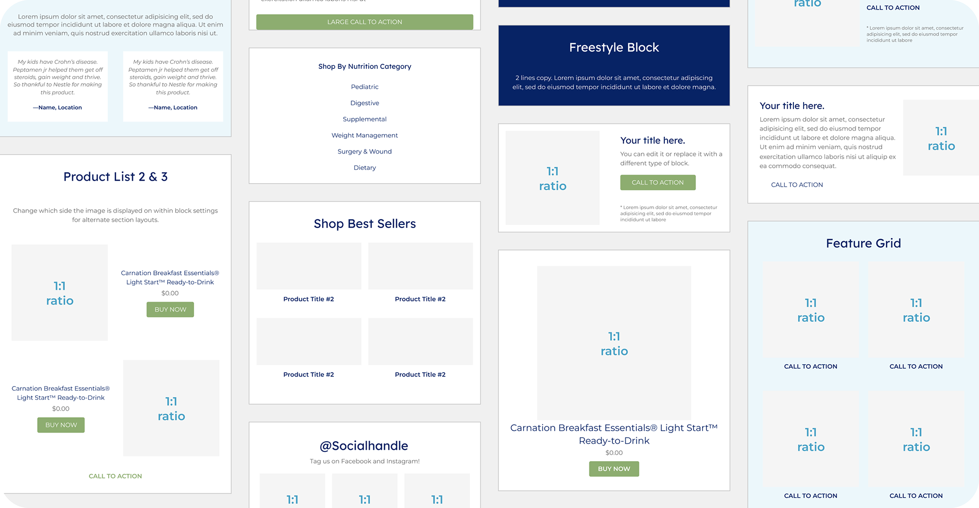
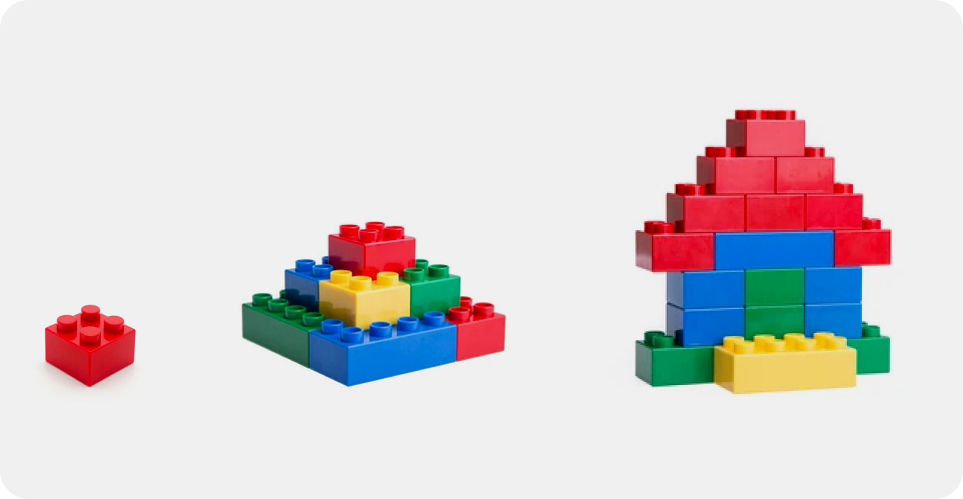
An overseas agency managed email deployment using an existing system, but the process was slow, and the system itself was limited. My job was to build a new modular block system so that emails could be assembled from reusable components rather than being bottlenecked by that process.
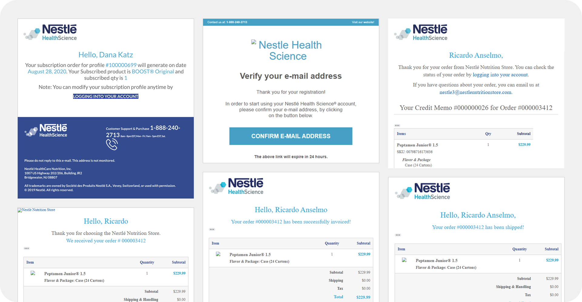
I started by running a heuristic evaluation of the existing templates. The Nestlé Nutrition Store emails were plain and text-based, which actually worked in their favor: with images disabled, the content still came through.
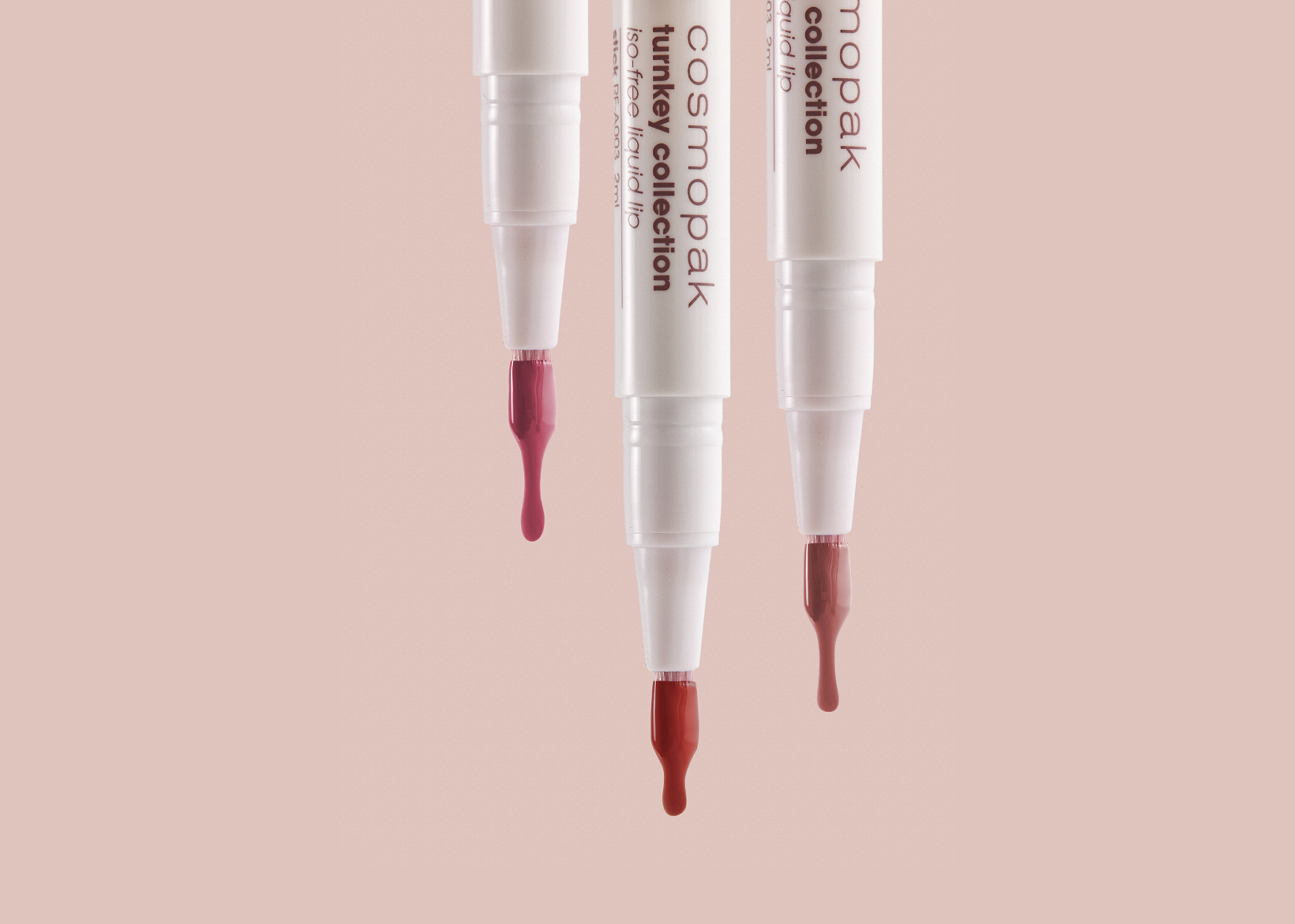
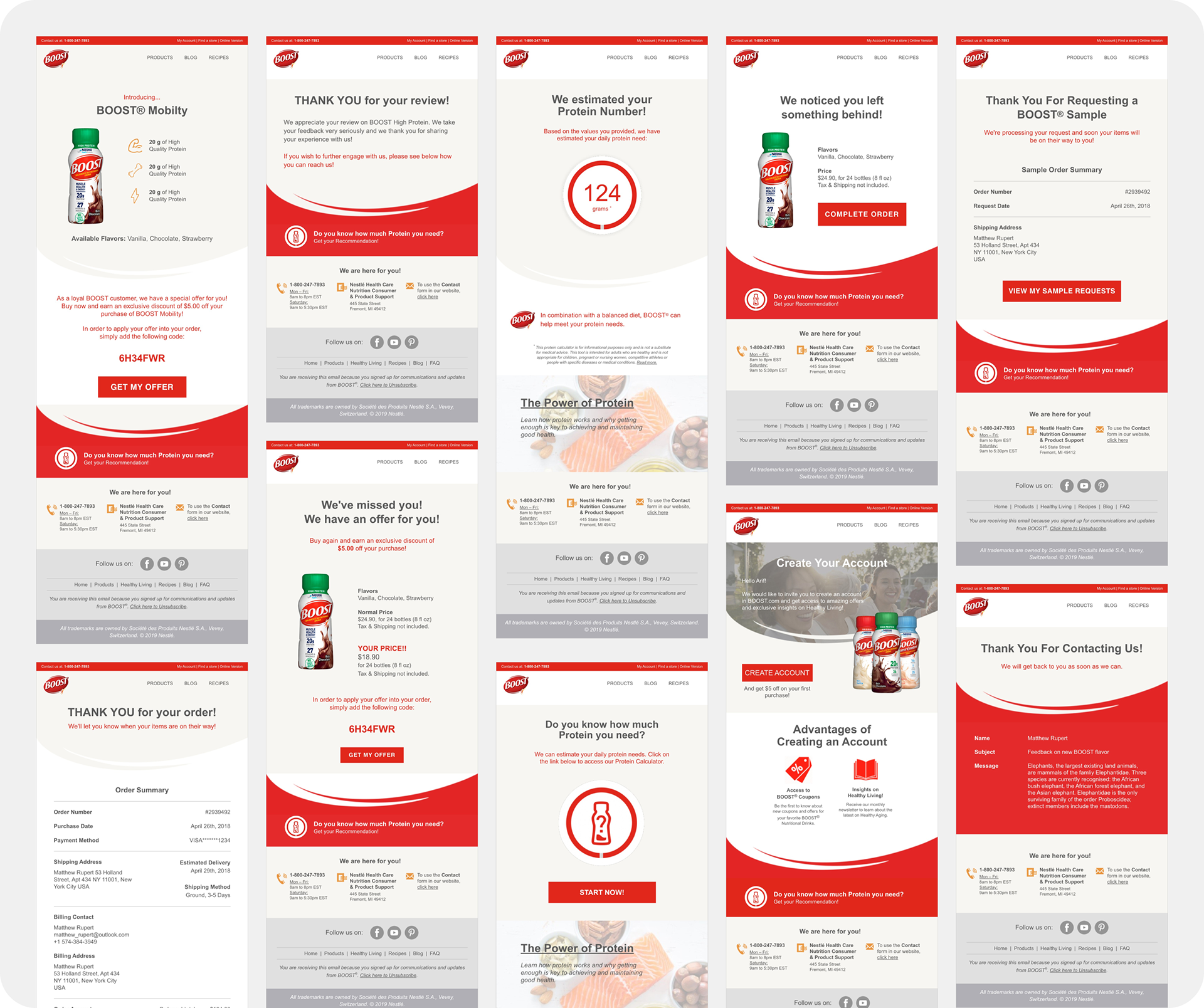
BOOST's emails were the opposite problem. They were heavily designed and image-based, which meant the message disappeared entirely for anyone with image downloads turned off. BOOST also presented its own design challenge. Red is the brand's primary color, but red carries specific meaning in digital interfaces: errors, warnings, destructive actions. Any new system built for BOOST had to use red carefully so it read as branding rather than a warning sign.
Constraints
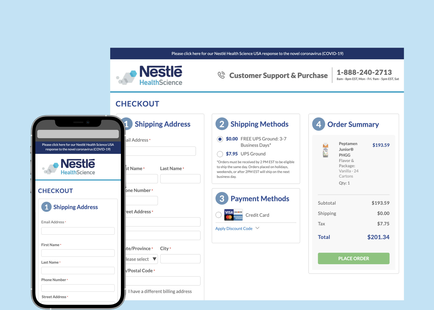
We built the templates in Figma, but the agency only accepted Photoshop files, which delayed the handoff by a week while we rebuilt to match. We were also working within Salesforce Marketing Cloud, which the CRM team later migrated off of in favor of Klaviyo, four months after launch.
What the data showed
Before finalizing the optimization approach, I looked at subscriber data across brands. 85% of all subscribers were on Gmail, with Outlook, Yahoo, and others making up the rest. That skew meant that Gmail and Outlook rendering became the priority for testing and optimization, rather than spreading effort evenly across all clients.
UAT testing
During UAT, specifically for Outlook, we found fonts that wouldn't load, spacing that didn't match the design files, and a mobile menu that appeared on desktop. Outlook's rendering engine is notoriously inconsistent with HTML email, and these issues required rework of the affected blocks before launch rather than a universal fix.
Font didn't load and space didn't match design files
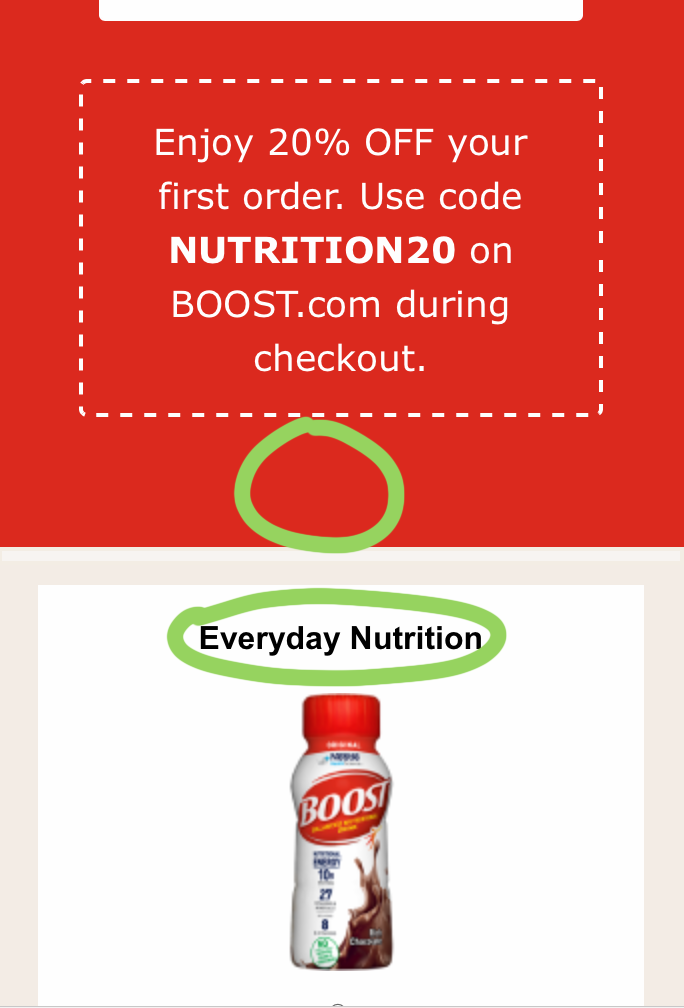
Font didn't load and too much space underneath the coupon
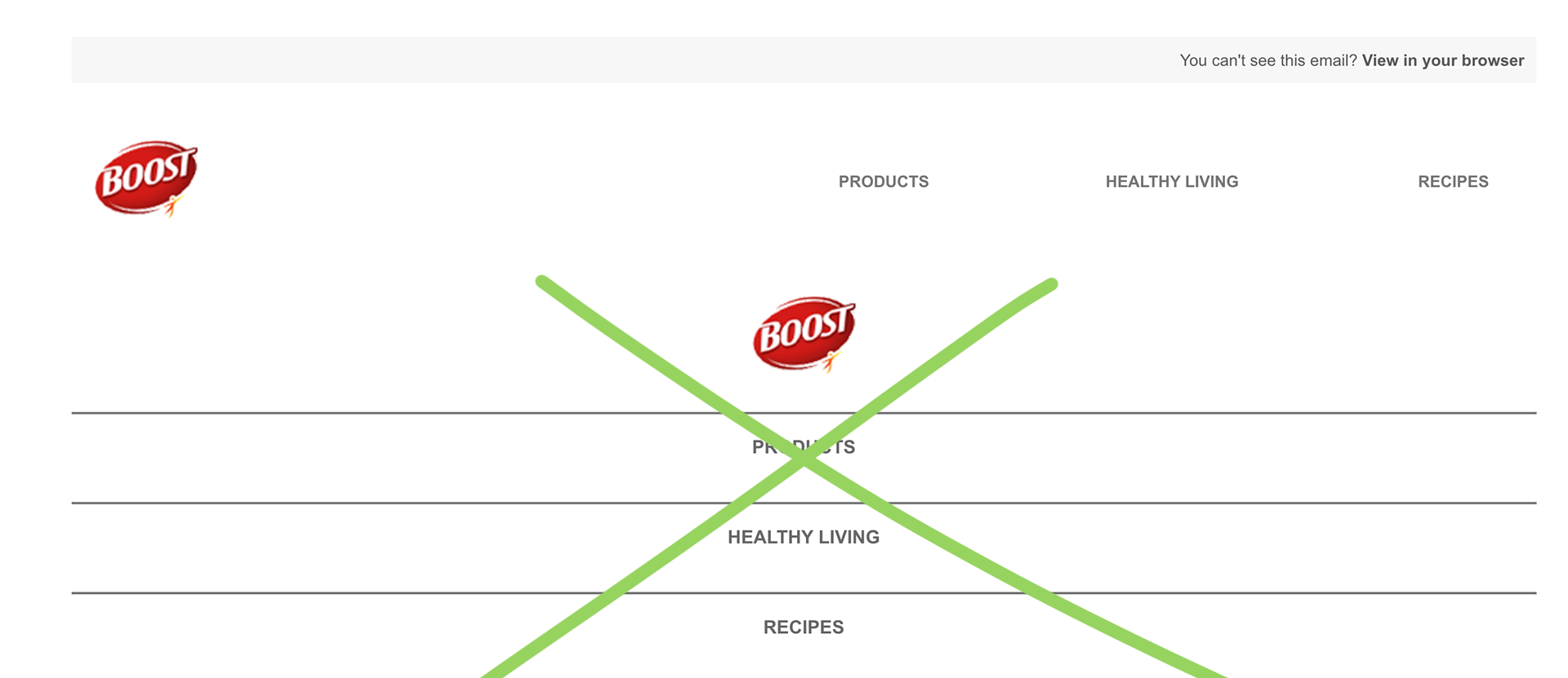
Mobile menu should be hidden on desktop

Outcome
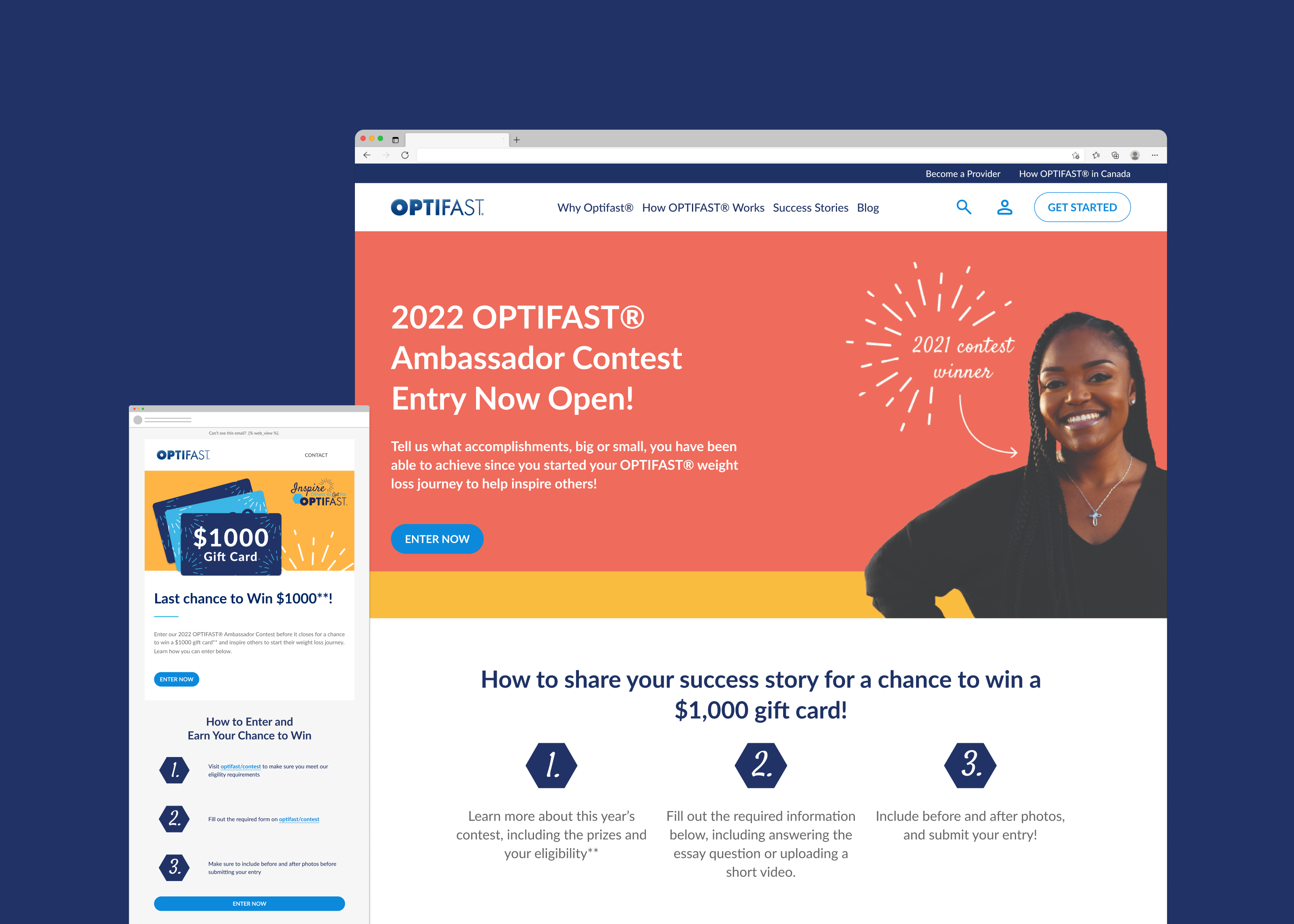
The system went live, starting with BOOST, and other brands were added as their websites were updated. The CRM team was responsible for this process. Once everything was running, emails were sent out on time instead of taking 3-5 days like before, when we depended on the agency.
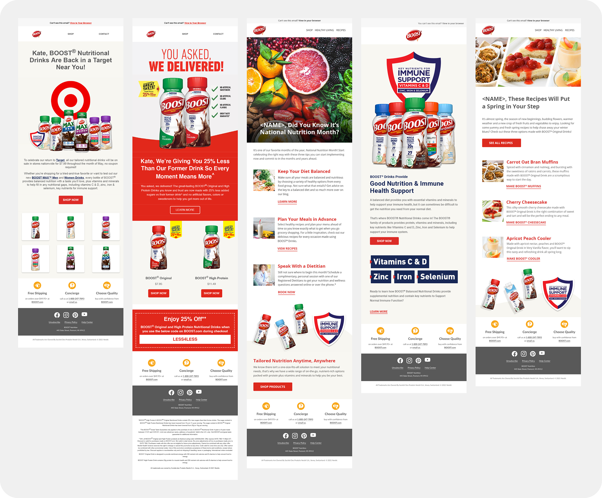
Deployed emails from Klaviyo
What I'd do differently
I assumed the agency had access to the same tools we did, and that assumption cost a week. I'd confirm tooling and file-format compatibility with any production partner before finalizing a design approach, not after the handoff. I'd also push to involve the development team earlier in the process, since most of the friction we hit could have surfaced sooner with that overlap.